GRAP

Report – Finished GRAP

For my Project Exam I have designed a logo, brochure, posters and flyers, and business cards for UOW Salsa Club in Australia, as well as making them a profile manual. The club was always very clear on wanting to have primary colours to reflect the club, and this has been important to consider throughout the whole process.

This slideshow requires JavaScript.

I am very happy with the designs I have created, for all products. The colour theme I have used is consistent over all designs, and binds them together nicely. The fonts used seem friendly and easy-going, just like the club, and also the organic elements back this up. I also believe it is easy to understand what kind of club this is. The logo quickly says dancing, not only because of the name, but also the icon.

The designs for especially some of the posters and the brochure vary quite a lot, but I don’t think this is a bad thing at all. First of all, the posters are meant to be alternated between over a year or so and meant to be a little different from one another, and secondly, this is a club a lot of different people should be able to somehow relate to.

The process of designing these products was a long and challenging one. I do, however, believe this long process helped me get an end result that not only I, but also my client, enjoy. Over the weeks I had good contact with my client, and despite the geographical distance between us, and time zone issues we had, we managed to communicate clearly. My client said towards the end of the project that I had done “exceptionally well to translate [their] vision for the club into what [I] did,” which of course to me is the best feedback I could receive from them.

Since the products had to work with the club, it was always very important for me to let my client have a say in regards to how they wanted everything to look. Our personal tastes may not always be the same, which was something I saw while working on this project, but for me the most important part is that they are happy. Besides, I would never have given them a design I personally didn’t think would work. I do believe everything I have designed works well for this club.

What this assignment truly has taught me is to work with a client. I have seen that good communication with the client is crucial to produce something that everyone will enjoy. I have also learnt more about how to design everything from logos, brochures, posters, and business cards, become more confident in both Illustrator and InDesign, and I even found myself thinking Profile Manuals were fun to write.

I was very worried when I first realised I had to contact a client myself, but I was very lucky in finding UOW Salsa Club, and now feel a lot more confident in contacting future clients. It was at times a challenge, though – but when my client finally said, “You weren’t aware I expect nothing but perfection, and you delivered!” I felt truly happy.

– This is an extract from the report I submitted, and my whole assignment of 80 pages can be read here: GRAP –

Until next time, stay creative,
Monika

Week 3: Product Designs

This week I’ve been working a lot on the designs for the brochure, posters/flyers and the business cards, as my plan always was to do.

MONDAY – Brochure: Finish Brochure. Posters: Digitising Posters

So glad to see that I actually managed to finish the brochure on the set date. Talking a lot to my client I have been able to come up with a design they are very satisfied with. I personally may have chosen one of the other designs, but to me the most important things is that they are happy with what I design for them – since they know the club a lot better than me.

I also made a few adjustments on the digitising I did of the posters before the weekend, and then sent these to my client to have them have a look at their favourites.

TUESDAY – Posters: Continue Work on Posters

My client got back to me and told me which posters they preferred, and which changes they wanted on a few of them. Some were to change some silhouettes, or moving some text, etc. and also to change some of the actual text since they wanted a few changes there as well.

Wednesday – Flyers: Make Sure Posters Work as Flyers (A5). Finish Posters and Flyers. Business Cards: Sketches

I finished the posters today, and made sure they work well in A3 and A5 sizes. Then did some sketches for the business cards, digitised these and sent these over to my client.

This slideshow requires JavaScript.

Thursday – Business Cards: Digitise cards

My client chose which layout they liked the best, and I then came up with some ideas for design etc. that could work with this layout.

Cards_DesignCards_Design2

Friday – Business Cards: Finish Cards

I finalised the cards, and finally reached my goal of designing a logo, brochure, posters/flyers and business cards for UOW Salsa Club in Wollongong, Australia. All that now remains of the project is to write the Design Manual and the report. I have looked through a few Design Manuals of other brands to get some inspiration.

Until next time, stay creative,
Monika

Week 2: Work Work Work

I forgot to publish this on Friday, but hey, I’m halfway through this project, and I’m glad to feel like I’m still on top of it all. I’ve been able to follow my schedule so far, and have been cooperating very well with my client to make sure they are satisfied with what I make. I make sure to write a short summary every day, so here we go for this second week of my GRAP work.

Monday – Logo: Continue Work on Logo

I kept working on the logo today, and my client seems very happy with the design I have come up with. Also spoke with my client about the rest of the products, and had some more of the texts and photos sent over to me.

Tuesday – Logo: Finish Logo. Brochure: Sketches

I managed to finalise the logo today, which allowed me get a little ahead of my schedule – I do not at all mind. So I then started working on sketches for the brochures, since I finally received all the text and images I would need to include in this. Also made mockups of the two brochure folds my client is interested in.

This slideshow requires JavaScript.

Wednesday – Brochure: Sketches and digitising. Talk to client

As mentioned, my client wants to have either a Z Fold or a Gatefold Brochure, so I tried digitising some of the sketches I did yesterday. I then sent these to my client so that they could choose the one they like the best, and I will keep working on this tomorrow.

This slideshow requires JavaScript.

Thursday – Brochure: Digitising. Posters/Flyers: Sketches

I started working on the sketches for the posters, trying to come up with a few different ideas. Since I am still waiting for feedback on the brochure from my client, I put this a little on hold and focused on the posters only today.

Friday – Brochure: Continue work on brochure. Posters/Flyers: Digitise ideas

My client got back to me in regards to the flyer, and have decided they wish to go with a Z fold brochure. They had a few things they wanted to change, such as certain photos being swapped etc., and had also come up with a new text for the organisational chart. This text was longer than the original one, so this ended up being a little of a challenge, but I think I managed to work around that quite alright.

I also kept working on the posters, and tried digitising some of my ideas. There was some text I missed yesterday, and since I got that today it was easier to work on these ideas.

Posters

Until next time, stay creative,
Monika

Week 1: Getting Started

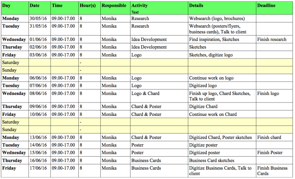
Week 1 is suddenly over, and I guess I have to say finally. For the last five days I’ve been sitting with this assignment for 8 hours a day, and that’s been pretty full on. But I’ve been able to follow my schedule and have done all the things I was meant to this week.

Monday – Reserach: Websearch on logo, brochures, salsa etc

Logo – I found my notes from Designing A Logo by Nigel French (which I saw a while ago), to refresh my memory. In this tutorial he explores topics such as the purpose of a logo, and what its qualites etc. should be. After this I searched for other salsa logos to get some inspiration, and made a moodboard.

Brochure – Continuing onto brochures, I then watched Designing A Brochure, which is also by Nigel French. French recommends to e.g. generate ideas by making mock-ups and create folding dummies, experiment with folding, and make sketch thumbnails. When choosing text and typography for the brochure, one needs to be concise (communicate clearly), use digestible chunks that communicate the message, consider pacing, stick to two fonts, create a hierarchy, and pay attention to even the smallest details (e.g. Letter and word spacing, correct dash etc). Throughout the video I also tried making the folds he did, to see how that actually works. I then did a Google search on this as well for another moodboard.

This slideshow requires JavaScript.

Salsa – Since this is a salsa club, I did a search on the dance as well. It is a lively dance music with many different styles, originated in Cuba and has both African and Spanish influences. The lyrics are usually about love and everyday life. The (usually) partnered dance is characterised by rapid movement of arms, shoulders, feet, hips, and turns and lifts.

Tuesday – Research: Websearch on posters/flyers and business cards. Talk to client

Posters/Flyers – This day I watched Nigel French’ Design A Poster, and tried creating my own versions of the posters he made. In doing this not only did I learn new techniques, but also got some inspiration to try and come up with something a little different from what you usually see, or expect to see. I also set up a poster document template in InDesign, which will help me create posters quicker in the future. French emphasised that the purpose of a poster is to grab the viewer’s attention. Wherever possible, simplify shape and detail, maximise contrast, use bold typography, and choose solid, strong colours, etc. Of course this depends on the style of the poster, but it is a nice rule to have in mind.

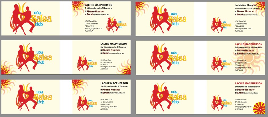
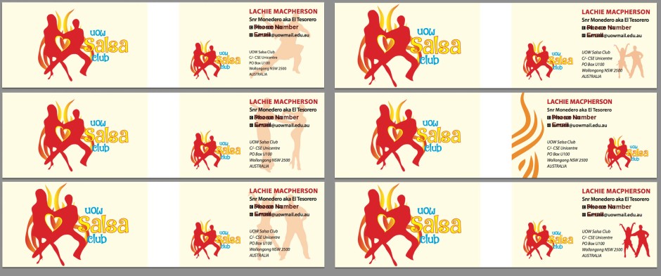
Business Cards – Following this I watched Designing A Business Card by French (what would I do without this guy?), in which he gave quite a few good guidelines. One advice he gave was to start with the person with the longest name if designing business cards for several people in a business (which I will do). In terms of the layout, his advices are to use a grid, establish hierarchy, and don’t fear the white space.

This slideshow requires JavaScript.

I also tried finding good definitions of posters, flyers and brochures – since these in some way can be a little similar: A flyer (or handbills) is usually a single, unfolded printed sheet intended to be held and read in the hand. Posters are bigger in size, although the size may vary here as well. They are generally posted (hence the name) at places where there is maximum visibility expected. Brochures (or pamphlets) can have certain similarities to flyers, but will almost always have printing on both sides, as well as containing folds that create multiple panels or pages denoted to information.

Target Group – All UOW students and staff, and non-students from the University, aged 18+, and all genders are welcome. The design then needs to apply to both males and females, and different age groups raging from 18.

Colours – To best reflect the club, they wish to use primary colours, to make it seem as vibrant and happy as it possibly can be. The colours used in the logo will be the basis for the rest of the designs for the club, to ensure consistency and a well thought through design that will bind all the different products together. In short, it needs to be fun and exciting, hip and passionate.

Wednesday – Idea Development: Find inspiration, sketches

Typography – I’m thinking a script would work well for the logo, since the club wishes to be seen as fun and exciting. It can’t be too strict, but I also need to consider the readability and keep scaling in mind. I have found the two fonts Black Jack and DK Jambo – which are fonts I think might fit. For the brochure, posters, flyers and business cards I’m thinking a sans serif font (Gill Sans for headings) might work well in combination with a serif font (Minion pro for body text). Many people argue that serifs make it easier to navigate visually through longer passages on print, as the serifs help moving the eyes along the lines of text.

Salsa Websites/Videos – After looking through websites for lots of salsa clubs, one thing is clear: they are all quite different from one another. Some use scripts for their logos and headings, while some go for sans serifs, serifs, or a combination of the latter two or even all three. The videos taught me that salsa is about the style. There is a lot of movement all the time. It’s sensual, and it’s passionate.

Sketches – I eventually made a mind map, before I began doing some sketches based on my client’s wishes. There was a wish of having a Z Fold brochure, so I made a quick mock up of this to better see what it would look like. I mainly focused on the sketches for the logo though, as a lot of the design for the rest of the products will be based a little on this. I sent my client some of these, to find out which direction they wanted me to go with the logo.

This slideshow requires JavaScript.

Thursday – Idea Development: Sketches

I continued with my sketches, still focusing on the logo, and having received some feedback from my client. They told me which idea they preferred and thought would suit the blub the most, and I kept working on this. One of their wishes was to somehow integrate flames into the logo, which I found out was quite the challenge to connect well with the rest of the design. As Nigel French says in one of his videos, a logo should be simple – and it should work in smaller and larger sizes, so if there is too much going on it won’t work too well at a smaller size.

This slideshow requires JavaScript.

My client also sent me the pictures they siwh to have in the brochure, as well as the member’s biographies which be part of that. This helped me get a better idea of what it really should look like, since I think the images are important to think of when considering the actual design for the brochure.

Friday – Logo

Today I kept working on the logo. After coming up with a few ideas for different flames yesterday, and sleeping on those ideas, I could continue this work with a fresh eye. I did these sketches digitally and quickly saw which worked the best.

Screen Shot 2016-06-02 at 19.56.24

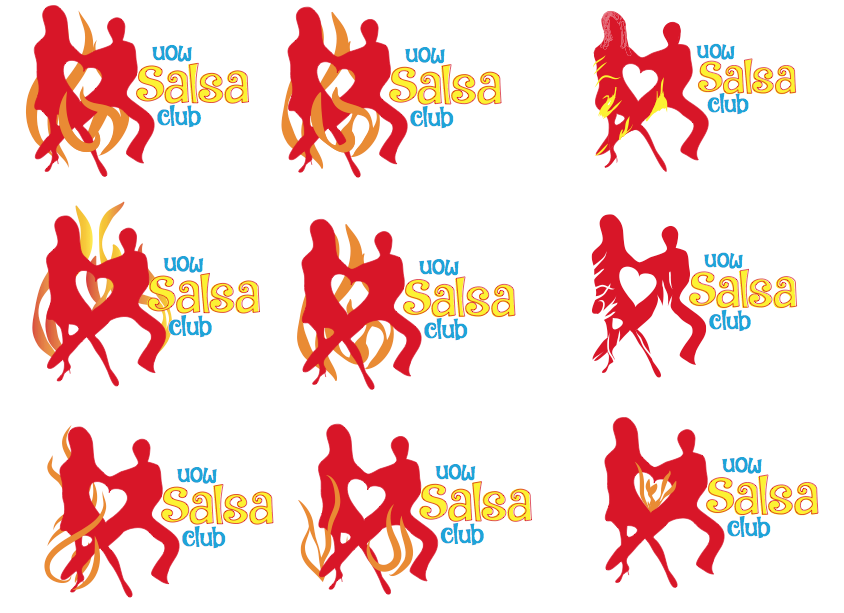
My top three out of these were; bottom left corner, bottom right corner, and middle row to the right. However, my client’s wish was the one to the left on the middle row.

Until next time, stay creative,
Monika

Project Description & Schedule

For my Project Exam in semester 1 I wish to work with UOW Salsa Club at the University of Wollongong in Australia. This client is looking for a logo, a brochure, posters, and business cards – all of which I think sound very exciting to work with.

Company/Concept

The UOW Salsa Club is one of the many clubs at UOW. It is a people centred (client focused) club, designed to enable both students, staff and non-students at the university to have access to affordable dance tuition, and at the same time broaden each individual’s social network by getting to know people outside the university or work. This also provides a social outlet from all the strains and constraints of academic pursuit or work for those who are non-students within a social, friendly and inclusive environment encouraged by a dynamic team consisting of current students. These students (the Executive Committee members) come from varying areas of stud- ies and life experiences in and out of the university.

Profile

They wish to be portrayed as having a fun and friendly club environment, complemented by an uber friendly and helpful team. The team’s wishes are to get more out of life and to leave a legacy for future students to continue to grow and develop in years to come.

Vision

In the future they wish to go from strength to strength, and be the most talked about and fun society who not only meet behind closed doors, but who bring the action direct and involve the people to make even the smallest of difference in their lives (be it at the university or outside). They want to be a well recognised club, and continually funded for bringing a social dynamic which any institution should support and embrace for betterment of all students and non-students’ experiences.

Target Group

The target group are all UOW students and staff (including Alumni), as well as non-students from the University. The age group is 18+ and all genders are welcome to join.

Why did I choose exactly this client?

I chose this client for a few different reasons: In 2015 I was a student at UOW myself, and I know how hard it can be to meet new people and make friends, so I really like the clubs associated with the university. These clubs bring people together and make it easier to get to know other students, and in the UOW Salsa Club you also get some cheap exercise.

Another thing is that the Committee members are very dedicated to the club. They all love dancing and want to make it accessible for everyone to enjoy, and wish to leave the club at UOW as a legacy for future students.

Thus, the reason I chose this client is that I want to support a club that first of all helps students make new friends, but also because the Committee members themselves are incredibly dedicat- ed. I think it would be nice to support these young students who really go out of their way to let other students get the chance to do something they love.

Problem Solving (Products)

Logo – At the moment the club doesn’t have a logo, but they would very much like to get one. The client’s wishes is a quite simple design with clean lines, and they wish to have it be rather vibrant. We would work with primary colours for this, and this is better explained under “Design.”

Club Organisational Chart – A friendly easy going type brochure reflecting the Committee members and the club.

I have been asked to make a club profile brochure introducing the Executive Committee Members so the target group will get to know them. In this brochure they wish to give a short background bio for each executive member, such as the President, Vice President, Treasurer, Secretary, and Instructor/Choreographer. Another element of the brochure would be to include their photographs and images from their classes, workshops etc.

The idea behind the brochure is to let it be easy for people to learn about the club, and where the times of classes will be written. This will be a Z Fold brochure of 6 panels, consisting of a title page, club organisational chart, as well as images from the club and classes in action.

Club Posters & Flyers – The club is looking for 3 one page posters and flyers with the follow- ing information: The Event – What, where, when & how much? The club would like posters that would represent the club and its lessons, and social dancing. Every Monday from 7 to 8 pm they have an hour class/lesson, followed by social dancing to practice the learnt skills and just have fun. It costs $5 to participate. They wish to have three posters with the same type of information, but different design etc. just to have something to alternate between.

Business Cards – The Executive Committee Members would all like their personal business cards with their respective roles. What they wish is to on the front have the Club Name (UOW Salsa Club), the name, position, phone number and email of the person, and the logo on the back. This means that even though there would be a few different cards, the only thing changing is the personal information, and the rest would stay the same for each card.

Screen Shot 2016-06-02 at 20.32.44Screen Shot 2016-06-02 at 20.32.55

Design

As mentioned, the club doesn’t have a logo (which is why they want me to make one), but for their Facebook page and events they have a few images they use – and they would like to keep the same theme (see examples below). They would like to use primary colours to make sure it is vibrant and happy, as this would very well reflect the club.

The club is happy with not using any real faces, but silhouettes, and would like to keep these in the new design. Since some of the images they have used even have copyright symbols on them, I would make new ones. Make silhouettes of dancers, and play around with happy colours, and different organic shapes.

Conclusion

In spending four weeks on this project, I wish to produce a logo, a brochure/chart, posters and flyers, and business cards for UOW Salsa Club in Australia, as well as making a design manual. The design will very much be inspired by the images attached; the use of strong colours, and silhouettes where people are part of the design.

Until next time, stay creative,
Monika