For this activity I kept talking to Kristjan, the personal trainer I made a brief with last week. As explained then, he helps his clients by setting up personalised programs to achieve their goals, and also helping them find healthy eating habits, etc. As a personal trainer he’ll be his clients’ “guide” at the gym when they want, and thus make sure that for example their techniques are right. A website would help him show potential clients what he does, what he can help them with, and how they can get in touch with him.
He wants a professional and simple website. This means to put focus on the content, and only use relevant information, photos, and so on. He wants the site to be modern, and have a look and feel that screams healthy, but is still relaxed. It is important not to go overboard with the healthy look, as that may even scare some clients, but also show that eating healthy and exercising can be both fun and beneficial.
His business strategy is to use the website as a communication platform for his clients. All relevant information will be easily accessed, and inspirational stories from earlier/current clients will help new clients see that what he does can actually help them reach their goals. The website’s role will be to reach out to a wide market, make his services seem for professional, and will be an easy way for his clients to learn about him. Because of this, it is obviously important to develop a website that is user friendly and which reflects his values.
- I would like you to use the information from this document and create a website architecture
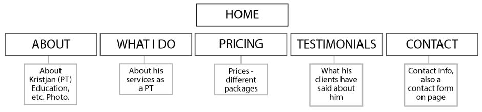
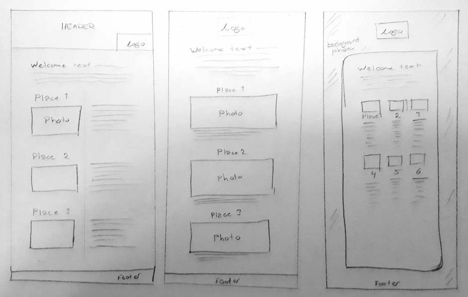
I set this up last week, but will go more in depth now. The navigation menu will have all the pages (About, What I Do, Pricing, Testimonials, and Contact) for easy navigation. Below is the branding banner, which will be on all pages, however with different photos on each page. Each banner will have his logo though, somehow implemented in the photo. The photos will help visualise what he does, and should all have the same mood and tone of voice.
The Main Content section will obviously vary on each page, with the relevant information for each of the pages. To the right will be the Facebook Feed (About, Pricing, and Home pages), or relevant photographs on the remaining pages (What I do, Testimonials, and Contact). On the bottom, the footer will have contact information, so clients can find that easily even without going to the Contact page.
- Now let’s focus on the web design strategy. Your document should justify all the major decisions you make – from the domain registration, hosting, design and target audience through to what you decide in terms of programming
Working as a personal trainer can be hard because there are quite a few who do, and finding enough clients to be able to do it as a living can often be a struggle. It’s a competitive market based on self promoting and being accessible. A website will definitely help Kristjan with this. My job will be to design a website that makes him come across as professional and more desirable than other personal trainers out there.
For his domain, he’ll use “ptkristjan” since this is short and quite easy to remember. This is also what he uses on other platforms, and is thus what people know him by. We have talked about using One.com as the hosting service, as this is a simple service to use, and they have a fairly decent price. They also have great backups.
One.com makes it easy to connect with WordPress, which is also one of the reasons we wish to use this hosting service: Since he may be updating the site on a bit of a regular basis, we have discussed using WordPress, as this is very user friendly. This will allow him to quickly change text, and add/remove photographs, etc. With WordPress we will also know the website will work well on different screen sizes, which was very important for him.
We spoke last week about updating his business card with the website url, and leaving posters and flyers at the gym he works at, with the website clearly visible. He understands that promoting the site is important to actually get viewers and visitors, and will include the address in everything he does, and everywhere. This means updating his bio on his social media accounts, his e-mail signature, and all printed materials.
The site will be simple, clean, modern, and seem healthy. Colours he is interested in using are blue, perhaps some green, and mixed with black. The fonts will be simple, and the photographs in good quality.
Until next time, stay creative,
Monika