Question 3 – Basic Principles of Layout
The third task for week 9/10 was to find a magazine, newspaper or book including both text and image. I found a magazine called digitalfoto, and placed tracing paper over the top of three spreads in this magazine. I then traced the grids on the page layouts, and wrote down the column widths, and margin sizes at the top, bottom, and to the left and right.
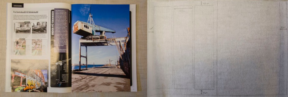
This spread is based on a three-column grid on the left side, and one on the right, on which the photograph is placed. The three columns’ widths are all 5,5 cm each. The picture has a width of 18,5 cm.
Both pages on this spread are based on a three-column grid. The width of each column is 5,5 cm.
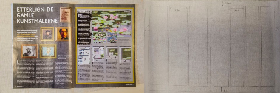
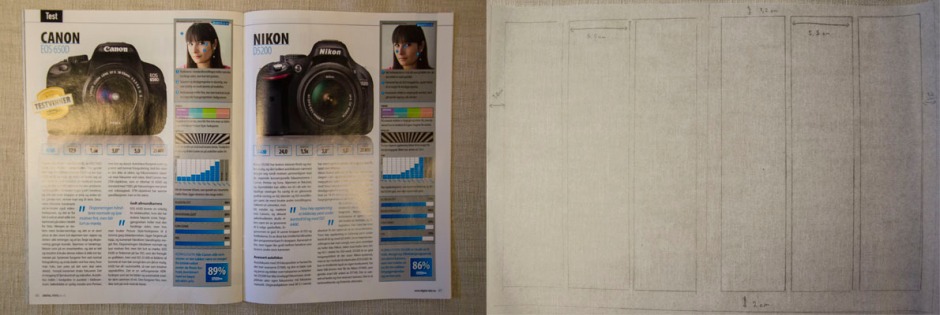
On this spread they use a three-column grid on the left page, and a four-column grid to the right. The three-columns are again 5,5 cm each, while the four-columns are 4 cm.
The margin sizes are as following:
Top, left and right: 1,5 cm
Bottom: 2 cm
Most pages are based on a three-column grid, but there are variations of this throughout the magazine. The margins always stay the same; even on the page where the photograph covers almost the whole page, there is a frame on the right side of the picture to make the layout consistent.
Question 4 – Pace and Contrast
In this task we were to compare the design (in terms of pace and contrast) of an online magazine, blog or website to that of a printed magazine, book or journal.
Before approaching this Learning Activity, let’s find out what Pace and Contrast are: “Pace and contrast are vital qualities for maintaining a reader’s interest in a design: they provide variety. This is true particularly in magazines and image-heavy books, where it is critical to be able to direct the eye to different pieces of information.” (Graphic Design School, page 48), they continue, “The pace will be dictated by the content and space available. Contrast is closely linked to pace: when you want to inject pace into the design you can create visual emphasis in the form of large type and imagery, or unusual cropping. Alternatively, you can create a quiet interval by having text-only spreads or employing white space liberally.”
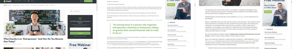
With this in mind, I compare the book “Sånn Er Det Bare” to Shopify’s blog. The layout of Sånn Er Det Bare is based on a two-column grid, and there is a lot of white space on the top of each page, which makes for a “lighter” reading experience. There isn’t all that much text on each page, and this makes it easier to read through it. The blog, however, has a lot more elements when you first open it. You see all the different posts straight away (kind of like the content in a magazine), and then go to the one(s) you wish to read.
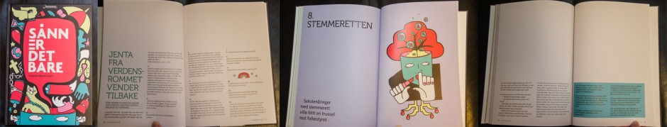
The ranged-left typography gives consistency, and different sizes of the visual elements such as illustrations create variation and visual interest. This is a layout used in both the book and on the blog. Each page in the book has slight differences from the others, in terms of how much space there is, how large the illustration is, and what colour is used. Quotes help create more visual interest on the spreads as well. The blog is somewhat more restricted, but can create a very interesting and unique look – and thus the readers might expect a mix of pace in the layout and content of each post.
An online blog has countless opportunities in terms of their visual input, they’re not constrained to using text and images only, but can also use audio, video, etc. This can be of great contrast to the text – and since we tend to have a shorter attention span online and less interested in reading long texts, audio or video files may create more interest. Since this isn’t possible to do in a printed version, contrast in the layout might be even more crucial to keep it exciting.
I would say the main differences I find between the kinds of design strategies used in these two formats are; the texts are longer on print than online (hyperlinks also helps with this, as not everything needs to be explained as thoroughly in the actual text), the use of audio and video help create more visual input, and there is usually less “action” on print.
Until next time, stay creative,
Monika