Project Exam Semester 3

Report – LUHB-Festivalen

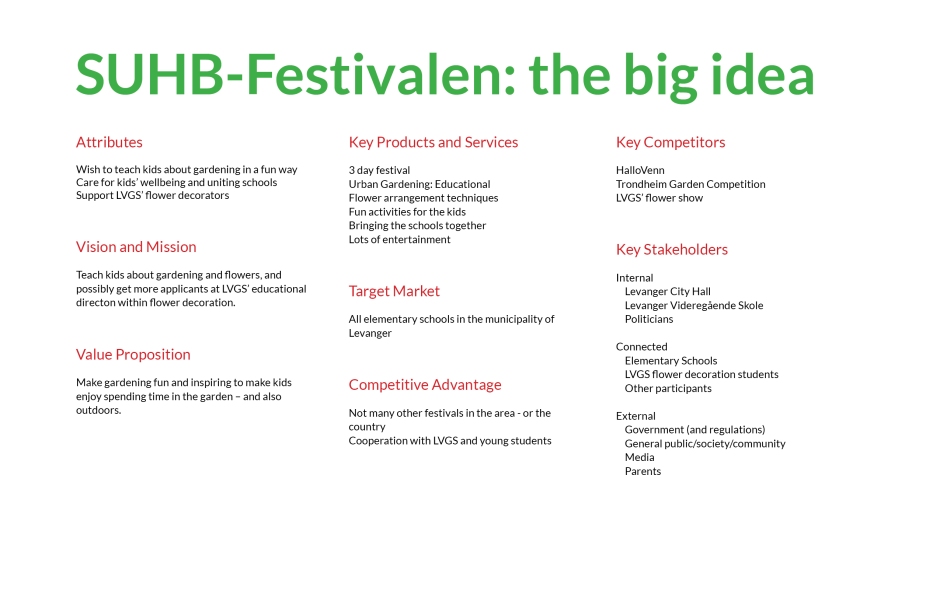
In this assignment I have developed the visual identity for Levanger Urbane Hage- og Blomsterfestival (LUHB-Festivalen). In doing this, I have had to do thorough strategic analysis and research, and then come up with a visual design to create the festival’s visual identity. All touchpoints created stay true to this identity, and should be appealing to the target group as well as communicating the festival’s essence.

This slideshow requires JavaScript.

I am happy with how the finished products, from logo to touchpoints to brand manual, came out. Using my colour scheme and set fonts, I think I have managed to create an identity that successfully expresses and communicates what the festival is about.

The logo definitely gets my attention, and it seems to have engaged everyone I have shown it to thus far. Keeping things simple can be a bit challenging at times, but I think the strong colours and my illustrations work around this in a good way, and create enough interest to grab attention.

Working on this assignment has been time consuming, a little challenging, but most of all fun. I definitely think I in one way or another have seen all learning outcomes come to play a role in the process from start to finish. The thorough research I did beforehand truly helped me get a good start when putting pen to paper.

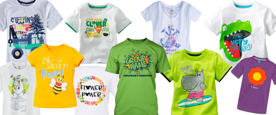
My target group has been on my mind through the whole process, since I know it is important to reach this group for a successful design. I have mostly focused on children, and I believe this shows. All in all the final products have developed the visual identity I had in mind early on, and the brand manual should reflect this.

Through this project exam I have learnt more about researching and analysing prior to a project, creative work and processes, design principles and layouts, creative solutions, and working in Illustrator. Most of all though, I have achieved a better understanding of the process of building a visual identity from scratch.

– This is an extract from the report I submitted, and the whole report can be read here: REPORT –

Until next time, stay creative,
Monika

LUHB-Festivalen’s T-shirts and Bracelets

T-shirts

The t-shirts were the third touchpoint I designed, and I quickly knew I wanted to make two designs to separate the two groups (year 1-4 and year 5-7). However, the first thing to do was to find some other children’s t-shirts I found interesting.

Screen Shot 2017-08-31 at 14.03.50

The purpose of the T-shirt

  • Promote the festival
  • Fun/souevnir for the kids
  • Communicate/express the festival’s essence to the schools (and parents)

Design

  • Logo (branding)
  • Visual elements
  • Year and group

My handdrawn sketches were as always quite rough, but explored different ways of presenting the content. Front to the left, and back to the right.

(more…)

LUHB-Festivalen’s Poster and Programme

POSTER

The first toucpoint I started on was the poster.

Screen Shot 2017-08-24 at 12.22.22

The purpose of the poster

  • Inform people about the festival (where, when, what)
  • Promote the festival
  • Communicate/express the festival’s essence to the schools (and parents)

Design & Format

  • A2 and A3 (same content and placements)
  • Visual elements (with logo elements)
  • Slogan (La fantasien blomstre)
  • Date, place (11.-13.september, Staup)
  • Activities

After this I went on to doing some rough sketches by hand, playing around with the characters I had designed, and placements of texts, thinking of different layouts, etc.

This slideshow requires JavaScript.

(more…)

LUHB-Festivalen: Designing Idenity

After my research and strategy planning I began working on what I reckon is one of the most important aspects of a brand identity; the logo. So first of all I had a look at other logos for children, and some that had something to do with flowers.

Screen Shot 2017-08-17 at 13.40.27

I then began drawing up some simple ideas. I mainly focused on a logo using a symbol, since I believe this will make the logo more memorable and unique – plus, I think children will be more engaged by this rather than text only. My idea from the beginning was to give my illustrations a bit of a comic feel, or at least simplified. This would help engage my target audience.

(more…)

LUHB-Festivalen Strategy and Briefs

Having done my research, I went on to clarifying the strategy, and setting up two briefs. In Designing Brand Identity, A. Wheeler argues the first brief, the brand brief, to be “most effective when it can be captured as a diagram on one 11” x 17” page.” (p.120).

Brand BriefCREATIVE BRIEF

Contact Info

  • Levanger Kommune
  • 7600 Levanger, Norway
  • +47 90 12 34 56
  • levanger@kommune.no

Background and overview of LUHB-Festivalen

LUHB-Festivalen will for the first time be held in Levanger September 11-13 2017. The municipality hopes to make this an annual festival in the middle of September, and wishes to invite all elementary schools in the area.

Vision: Teach kids about gardening and flowers, and possibly get more applicants at LVGS’ educational direction within flower decoration.

Strategies: Make gardening fun and inspiring to make children enjoy spending time in the garden – and also outdoors.

Goals: Get all the elementary schools together for a few days to make new friends, have the kids spend time outdoors in an educational environment, and teach them about urban gardening and flowers.

Values: Urban gardening, flowers, kids’ health, solidarity, friendship.

(more…)

LUHB-Festivalen Research

Due Week 17, Friday 08.09.17 at 4 pm

For this semester’s project exam I will need to develop a logo and visual identity for a fictive flower festival in my hometown. Since we’re focusing more on strategic design and the process of building a brand right now, I’ve put quite a lot of effort into the research to clarify the strategy for this assignment.

In addition to a logo, I will design a few touchpoints to promote the festival, as well as a brand manual.

Client

This assignment doesn’t define a client in particular, other than it having to be a festival set in our hometown, or nearest town. I live in a town called Levanger, which is the administrative centre of the municipality also called Levanger. This is a quite small city with almost 10 000 inhabitants, and it has been part of the Cittaslow initiative since 2003. According to IMDi, the average salary of Levanger’s population is 346 500 NOK/year. The current Mayor represents the Labour Party.

Levanger is a “student town” and has been for decades. All stages from preschool and up to university are offered, making it highly attractive for students and families. It is also one of the best farming districts of the county and has a comprehensive and vast industry.

Since there are many kids and students here, I want this festival be for kids in elementary school. So the client is Levanger; and as an initiative to make people interested in flowers and urban gardening, they have come up with the idea of a festival for kids. At Levanger Videregående Skole (Secondary School), LVGS, one of the educational directions is within flower decorations, so this is also a plan to teach kids about this option and maybe getting more applicants.

(more…)