Below are a selection of my best Learning Activities from the two years at Noroff. To see all activities for the four semesters, navigate through the dropdown menu above, or simply click the links below.
Stay creative,
Monika
Below are a selection of my best Learning Activities from the two years at Noroff. To see all activities for the four semesters, navigate through the dropdown menu above, or simply click the links below.
Stay creative,
Monika
[Am I right in this being the last learning activity? If so I must admit that is both kind of strange and also feels really good. However to not get into problems with my current job, I just wish to specify that the covering email below is not one I’m planning to send to anyone anytime soon. I’m very happy with my current job as a graphic designer.]
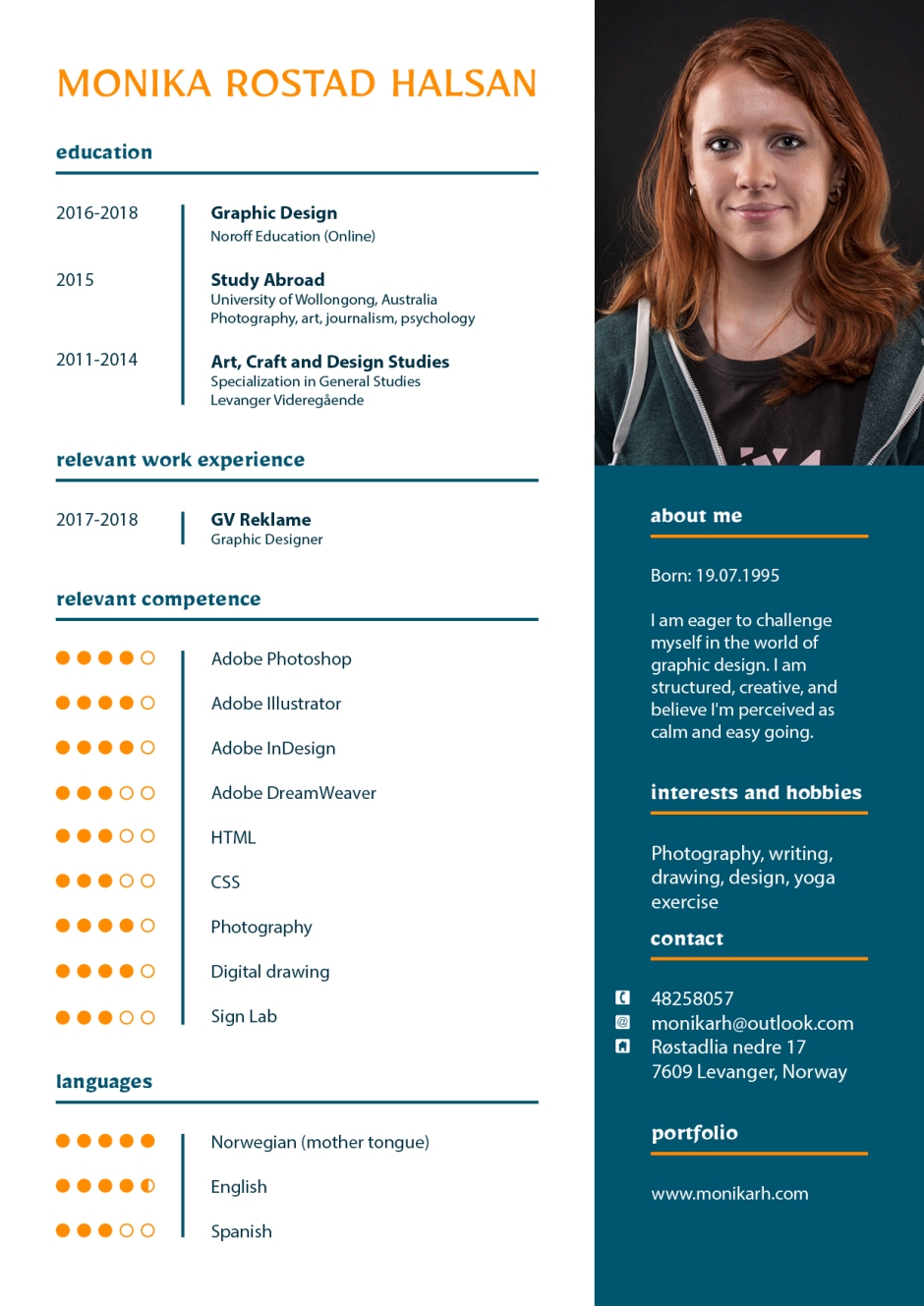
Publish a résumé and covering email as if you were applying to work at a real company.
Ideally you would also provide a portfolio website, but this will be completed over the next couple of weeks, so don’t worry about that now.
Covering Email
Dear Sir or Madam,
I would like to express my interest for the graphic designer position at [company]. As a recent graduate with graphic design experience, I believe I am a strong candidate for the position.
Working at [company] seems exciting as I am very interested in the creative field and graphic design. I enjoy working with deadlines. As a graphic design student I have tested myself through establishing identities for both real and fictive clients. This includes logos, business cards, websites, branding, brochures, posters and more.
I have worked as a graphic designer at a local business since the beginning of my second year of graphic design studies. In my position there I have worked with over a hundred clients, building brand identities through logos, business cards, car decoration, building decoration and more. These projects have helped me gain experience in working with very short deadlines, a variety of different clients and design preferences, and seeing the process through from the brief stage to the finished design.
Being organised, reliable and creative has so far helped me in past design projects. I believe I am seen as a calm and easy going person with a good work structure, and a quick learner.
I have attached my CV with this letter and I hope you will look over my application and consider me for the position. I look forward to your response.
Best regards,
Monika Rostad Halsan
I’m now very excited to see how the project exam over the next 7 weeks will go, and the portfolio following. And after that I suppose it’s time to graduate!
Until next time, stay creative,
Monika
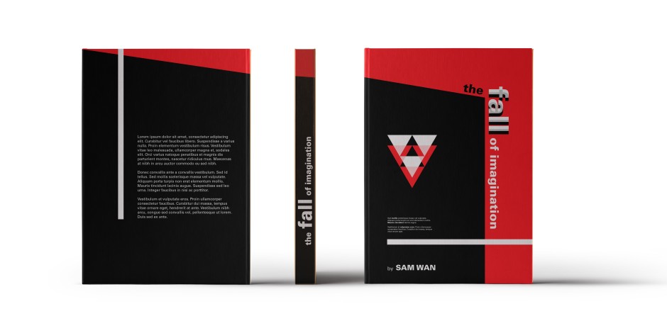
Design a book cover for a thriller book called “The Fall of Imagination” by Sam Wan. This book does not exist and is open to your interpretation as to the subject matter.
It must be designed by clearly drawing inspiration from a previous design style.
The size of the cover must be A5 and it should include a front, spine and back.
The cover must contain a simple vector illustration that forms the basis of the design.
The cover must contain the title and the name of the author.
Publish your design as a PDF document.
I took inspiration from Swiss Design for this book cover.
 Book Cover PDF version
Until next time, stay creative,
Monika
Work through my sunrise example step-by-step. Upload your version of this project to your WordPress blog. Please note, you will make a better impression if you make this animation your own. Don’t be scared to take things a little further and experiment.
I didn’t really take this much further since I wanted to rather focus on the next activity using my own concept and ideas, and also because I need to spend some more time on the Title Sequence for MA06.
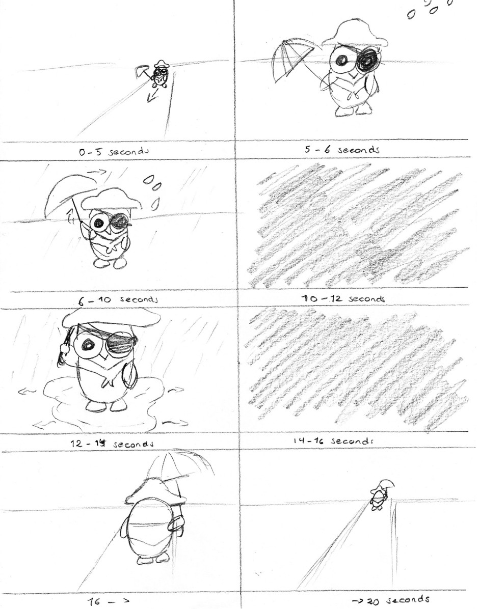
Now you need to come up with a unique animation concept of your own. Create a storyboard for this concept. (Make sure that your idea is not too complicated, but don’t limit yourself by making it overly simple.) Scan your sketches in and upload it to your WordPress blog.
Question 1
When shooting in low light conditions I will first of all make sure I have my equipment ready. For me this usually means using a tripod, and a remote control, in addition to my camera and the lens or lenses I imagine I will be needing for the desired photograph, and sometimes an external flash.
My settings will depend on what kind of photograph I wish. If I want to capture the movement of water, or the lights of a moving car, I will use a long shutter, preferably up to several seconds. My aperture may then be small (high number), depending on the light conditions. But maybe I’m doing a portrait of someone, and don’t want any movement. My 50mm lens is perfect for this as it allows me to use a large aperture (low number: f1.4 is this lens’ lowest), which not only allows more light to hit the sensor, but also creates a beautiful low depth of field.
I usually first decide whether or not I want motion blur in my photograph; if I do, I use a long shutter, and if I don’t I use a quick shutter and may need to use a larger aperture. In addition to this, though, I can change the ISO. In good light conditions I normally set this to maximum 800, but in low light sometimes you need to challenge this a little – however, the higher the number, the more grain in the photo. This might work on some photos as it can create a beautiful atmosphere, and other times it may not work as well. It all depends on the desired photograph.
A tripod and a remote control (or the camera’s self timer) are ways of avoiding any camera shake as the photo is being taken. If the light conditions are not ideal for the desired photograph, a flash may aid me by bringing in artificial light, which I’m in more control of. I never use my camera’s pop-up flash due to it looking quite unrealistic and harsh, and rather go with external flashes. This way I can choose its direction, and make sure it doesn’t hit the subject/object the same way the pop-up flash does. Finally, colour temperatures need to be considered: I usually set my white balance to auto due to mixed lighting scenarios, and since I also shoot in RAW I will normally have the option to edit this after taking the photo. Sometimes though, a grey card can be a really helpful tool to work around colour temperature.
Over the next two weeks our focus should be the magazine, which is due Friday 12th of May. So we only got one learning activity, which should take us about 2,5 days (plus uploading on the forum to get feedback from the tutor).
Practical Assignment
I chose Graffiti & Street Art (1970-2000) as the style, and Banksy as the designer from that style that I feel best relate to my personality. I’ve been very interested in Street Art for many years, and did some pretty cool spray paintings in Upper Secondary School. Banksy has also been my inspiration for assignments both in school and uni, so I figured I relate to him in several ways.
Banksy – whose real identity still remains unknown – is a British street art artist, political activist, film director, and painter, active since the early 90s. His satirical street art combines dark humour with graffiti executed in a distinctive stencilling technique.
I have never enjoyed graffiti writing with a wide variety of colours etc., and no meaning to them. What Banksy does on the other hand (and many other street art artists), is raising issues and making people stop and think for a bit, which I really like. He makes a statement with his work. I’m personally quite engaded in different topics such as human and animal rights, so I believe street art therefore is a way in which I could express myself well.
I used Litscape to see different words the letters of my name can make. There were quite a few with so many letters, however some of course just didn’t fit what I wanted. I quickly decided I wanted my magazine to be about extreme sports and things like that, so I tried finding words that could somehow relate. I ended up with the word MANTRA.
Monika Rostad -> MANTRA
This week’s learning activity we had to customise a WordPress site/theme. I started playing around with a child theme already in week 30, but I think that only benefit me for this week as I then already knew where to start. The theme I’m working with is “Hitchcock” by Anders Norén. This theme is described as “a minimal portfolio theme for designers, photographers and other creatives. It features a beautiful responsive design, a social icon menu, Jetpack infinite scroll, custom accent color, custom header image, support for gallery post format, editor styling and much more” (WordPress).
To compare my design with the theme as it was, check out this website.
In short, the changes I have made to the design are the following:
I imported the web font Mirza and used this for headings and blockquotes. Myriad Pro is used for body copy. A light and a dark blue have been used to colour headings, buttons, etc. The blog’s width is changed and so is the content’s, search field is removed, and the social menu bar is moved to footer. I think these changes have customised the website quite a bit. And adding a few plugins has in my opinion made this look like a pretty neat portfolio.
Read this for a more thorough explanation.
Until next time, stay creative,
Monika
It took me quite a while to get the learning activity for this week done, as I mostly focused on getting my Photo Essay ready, and also wanted to finish Foundations of Photography: Composition by Ben Long on Lynda.com before taking the photos I had to. This week has been about the Art of Photography, and we have looked at composition fundamentals as well as the importance of geometry, light, colour, texture etc. in compositions. So after watching the video, we had to shoot photos for each of the following topics (inspired by Long, I converted most of my photos to black and white to really focus on the composition):
Pattern
Symmetry
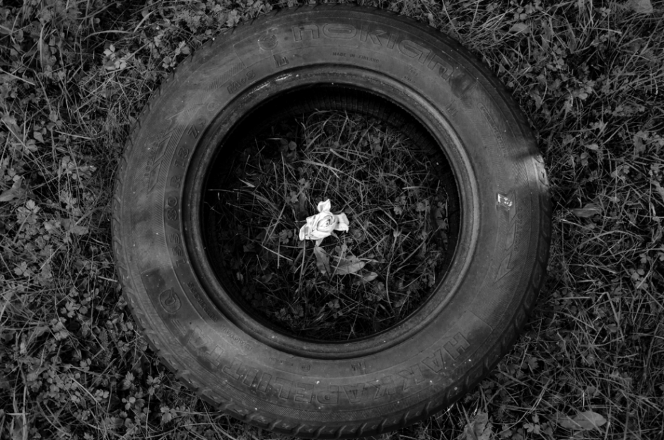
Texture
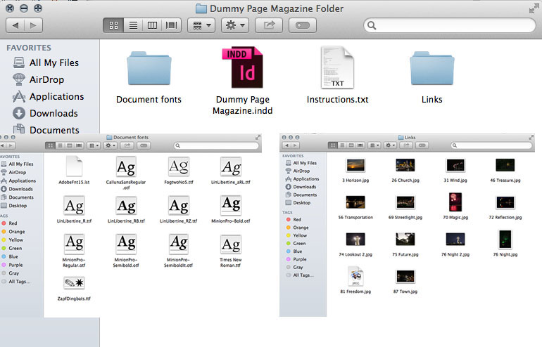
The third task, which was the biggest Learning Activity this week, was to do the exercise files for the Lynda tutorials Designing A Magazine Layout by Nigel French, and InDesign CS5: Print Production Guidelines by James Wamser. I wasn’t sure what exactly was expected of me to do here, as there are so many similar files in each exercise file folder, but I did my best.
Designing A Magazine Layout
Since Nigel in this tutorial made a magazine, I did the same. I based my layout on the same grid as him, obviously setting up the different elements etc. myself. I changed the pictures and headings, and also changed the main text colour to one I sampled from one of the images.
InDesign CS5: Print Production Guidelines
Document Construction
I felt that this tutorial had more practical exercise files in the beginning of the video, and I did all of those, creating a few different documents etc. I simply took screenshots of these.
The second task this week was to design a simple dummy 20-page magazine. I had to use a spot varnish on the front page, and use two spot colours. I decided to use these spot colours for text only, and interpreted the assignment to let me use original colours on pictures. For my magazine I chose to focus on night photography, although the actual body copy is placeholder text. All photos are taken my be, though. In creating this I took a lot of inspiration from Designing a Magazine Layout by Nigel French, which we have to watch this week. Just to show a few examples of some of the spreads:
Since this week is focusing on print preparation, after designing the magazine I had to make use of my printing checklist and prepare the file for print. This also included deciding what paper weight and type I want to use, as well as the type of binding. We were asked to submit the print-ready file packaged from InDesign as well as a print-ready PDF, however not all these files will upload to WordPress. So instead I’m submitting a few screenshots and PDFs.
This week has been extremely tiring, as a lot of hours have been put into working on MA04, but it feels good to finally having submitted that. I suppose I will have to spend tomorrow on doing the last of this week’s learning activities; thank god I already finished the exercise files for the first Lynda movie we had to watch.
Until next time, stay creative,
Monika
