MA 07: Branding & Packaging

Report – Branding & Packaging

This four week project period has for me been about designing a brand identity for a fun, energetic and organic puppy food brand. A logo, brochure, infographics, brochure, packaging and point of sale elements have been created and designed to give the brand an identity.

My food product brand is an all organic brand based in the UK, called Natural Puppiness. The brand targets young people with puppies, and especially people interested in the outdoors. The product I’m focusing on marketing here are dry pellets.

This slideshow requires JavaScript.

My development and work process have been consistent and rather thorough throughout the whole project period. It has been fun and challenging assignment to work with, and extra exciting to be getting parts of the assignment handed out over several weeks.

I’m happy with the products I have designed. The brand is consistent in terms of its design, colours and layouts. I also believe I have created a design that does indeed make the brand seem friendly, healthy and organic. Based on the design I would personally consider the brand had I had a puppy myself.

– This is an extract from the report I submitted, and the whole report can be read here, including the brand manual: REPORT 


Until next time, stay creative,
Monika

28: Packaging Design

This week’s task has been to design the packaging for the dog food product. I have decided that my product is dry pellets, which means that its form is solid and I don’t need to make the packaging out of waterproof material. I would like it to be easy to open and close this bag since it’s meant to last for a little while, so I need to make sure it’s easy to store. It needs to be strong, since I’m thinking it should be about 5 kg. In making the design we of course had to consider the other products we have already made, to make sure they integrate well with the brand identity.

Exploration –  Use sketching techniques to draw thumbnails and hand in your thumbnails as scanned PDFs.

I did a few thumbnails for both different packaging formats, as well as the design when I had chosen the type of packaging I wanted.

Brand Integration –  Choose one of your thumbnails and refine your design. Place it next to your brochure and logo and see how you can merge your design with the brand identity. Also, what fundamentals of the brand can you draw from and use in your design? Hand in a picture of your thumbnails, mock-ups, logo and brochure together.

(more…)

27: Illustration, Infographic and Brochure

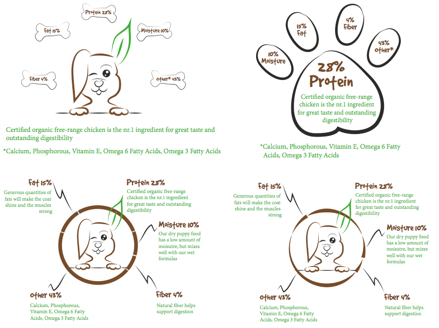
The second part of MA7 was to design a brochure for the dog food product. This brochure has to contain an infographic illustration using fictitious data. It must display the nutritious value of the food, and give an indication of consumption per size of dog. The purpose of the brochure is to introduce the product and the infographic, and it has to complement and blend in with the logo.

After adding a few words to my mind map, I began sketching.

Nutritious values

I then tried out the best ideas in Illustrator, to see what they might look like.

screen-shot-2016-11-22-at-19-19-21

Because of the feedback I received on these four, I chose the one in the bottom left corner and did a few changes to this before I got the result I wanted. The design of this is quite simple; it uses the sans serif font Myriad Pro for the body text and the logo font for headings – which again display the different values well. The lines going from the circle to the headings are also in relation to the logo, with the black lines being made out of the mountains.

(more…)

26: Create A Logo

This week we got our MA7: Branding & Packaging, but “due to the scale of this assignment, these four weeks are to be considered a project period where the learning activities all come together to form the Mandatory Project.” So the first task, for this week, was to first of all develop a name for the dog food project we’ll be working with.

I decided to call my product Natural Puppiness. My target group are young people (in their 20’s) who just bought their first dog (a puppy), and who enjoy taking their puppy outside with them. They are interested in giving their dog the best food; food that gives them energy to play outside, and that will keep them helathy (organic food: natural). UrbanDictionary’s definition of the word “puppinees” is: “The feeling of unbearable joy brought on by the appearance of puppies. A fluffy, happy feeling of adorable joy from the undisputed masters of cuteness, puppies…” I also would like to think the word can translate to a puppy “in happiness.”

After coming up with a name, we had to design a logo for the product, using full colour. This logo has to consist of a main visual, and typography, and in creating it we had to follow four fundamental steps, in a particular sequence. Before I started I also made a little mind map for the logo. Puppy (Cute, Young, Energy – Playful), Colours (2-3, green, brown, black, high saturation), Symbol (Puppy face, Paw, Nose), Typography (Name, Organic), Happy (Cheerful) are the words I put down.

Exploration – Use sketching techniques to draw thumbnails and hand in your thumbnails as scanned PDFs.

Focus – Highlight three of the thumbnail ideas that you consider the best options and state why. Hand in an A4 with visuals of the three chosen thumbnails; include reasons for choosing each of these three options.

(more…)