MA 02: Door to Door Organics

Report – Door to Door Organics

In this assignment I have developed the new visual identity for Door to Door Organics’s expansion to my local community. In doing this, I have had to do thorough strategic analysis and research, and then come up with a visual design to create the brand identity. All products created stay true to the new identity, and should be appealing to the target group as well as communicating the brand essence.

Box Mock Up1-2

2

I am happy with how the finished products, from logo to touchpoints to brand manual, came out. Using my colour scheme and set fonts, I think I have managed to create a brand identity which expresses and communicates what the business is about.

The logo is definitely one that gets my attention, and it seems to have engaged everyone I have shown it to thus far, which makes me think it is successful. Keeping things simple can be a bit challenging at times, but I think the strong colours and my illustrations work around this in a good way, and create enough interest to grab attention.

Since this assignment was very focused on the research stage and strategic analysis, I have definitely learnt a lot about this. I really got to see how much one can benefit of defining the problem, setting up creative briefs, and constructing a visual identity from the start. My process has been quite a long one, and I have spent a lot of time thinking of how to keep the brand true to the identity I wanted to develop.

The consumer profile I set up has been on my mind through the whole process, since I know it is important to reach this group through the design. I have focused most on kids, and in trying to reach families with young kids; and believe I have achieved this. All in all the final products have developed the brand identity I had in mind.

– This is an extract from the report I submitted, and the whole report, including the brand manual, can be read here: REPORT –

Until next time, stay creative,
Monika

SaveSave

Door to Door Organics Car Wrap

Moving on to the car wrapping I had a look through phase 4 in Designing Brand Identity for inspiration, since we haven’t learnt about vehicle wrapping before. I knew I had to work with a delivery van, so I went online to look for inspiration – and also found myself paying extra attention to vehicle wrappings when outside.

Moodboard

Design

  • Logo (branding)
  • Website (text)
  • Phone number
  • #joydelivered
  • Visual elements (grocery illustrations) or blocks of colour

Since I didn’t have to consider the actual printing that much, I found some .png photos on Google of a white Ford van I considered a good option. I quickly traced the outline of this car to print and do some analogous sketches to begin with. I did miss, for this part of the assignment, an actual dieline or template to follow since a real client would normally provide this (or at least say something about what car it is), but did what I could out of the information I had been given.

In the brief all that was said was to design “decoration on the delivery vans” as an additional touchpoint, so having this in mind, I simply considered creating a decoration that would communicate the brand’s vision and identity. Since it is meant for a car wrap, I knew a QR code for the website wouldn’t be ideal as people might see it whilst driving, and I knew the elements’ sizes should be rather large since one has to assume that people will see it from a bit of a distance.

Since I used blocks of green and white, and grocery illustrations on the packaging design, these are the elements I tried bringing over to the car wrap. I only did the car from one side, thinking I could easily use the same content (but maybe swap their placements) from one side to the other. And of course I also had to consider the back and the front of the vehicle, since these are important as well.


I have never made a car wrap, so I wasn’t sure how to begin the digitizing at first, but after quite a lot of trying and failing I found Thomas Baekdal’s video on How to visualize a realistic car wrap on YouTube, which had some great tips and techniques for what I needed to do.


This slideshow requires JavaScript.

From all my attempts I found an idea I felt was ready to present for feedback.

Screen Shot 2017-06-12 at 22.37.07

Having done this I was recommended to make the contact info larger for potential customers to easily see, and also to add a slogan which would suggest what the company does. I think these adjustments really improved the design a lot, and I’m in general very happy with the green blocks and how all elements work together. I was a bit worried making the website URL run across two lines on the back, but I think it works and people will still understand.

This slideshow requires JavaScript.

Until next time, stay creative,
Monika

SaveSave

Door to Door Organics Packaging

The first touchpoint to design was the packaging – “suitable packaging for their products.” So I began doing some research on what materials to use, and what to remember.

The purpose of the packaging

  • Functional
  • Practical
  • Hold the content (food) in a secure manner
  • Durable (will be transported in delivery vans)
  • Look appealing on someone’s doorstep
  • Communicate/express Door to Door Organics’ essence to the consumer

Material

The content that will go into the packaging containers are fruit and groceries, meat and seafood, and dairy and eggs. These products will be transported in delivery vans, and may be left at people’s doorsteps should they not be at home. This means that the products may be left outside for quite some time, and both temperature and transportation are therefore factors to consider.

When thinking of different packaging options, I simply followed a few questions to guide me through the process, such as: Is the material strong, light, available, flexible? Is it biodegradable? Packable? Stable? Will it store the product in a good way? Will it keep the product at the right temperature? Is it transportable?

Door to Door Organics in the US already uses cardboard boxes. Since they care for the environment they encourage their customers to help them recycle and reuse these boxes, and will always pick up any packaging materials left outside on delivery day. To help keep the food fresh and cool, they use ice packs and insulation. One review on Yelp.com states that “Perishable items always arrive carefully wrapped in icepacks and other cooling devices to ensure that they don’t go bad before you have a chance [to] bring your Box inside. Many a Friday, I don’t get home until 10 or 11 p.m., and the eggs/milk/cheese (and even fish!) are still in perfect condition on my porch.”

Another option is to use wooden boxes. These may be more in line with the company’s look and feel, but these will be heavier than the cardboard boxes (Door to Door Organics is meant to make life easy for the clients, and even though there won’t necessary be a huge weight difference, this is a factor worth mentioning). Printing onto the material will not necessarily be an as easy and quick process as with cardboard, but may get a really cool look. The advantage of wooden boxes over cardboard boxes is storing; it is a strong material on which one can place several other boxes, compared to what a cardboard can hold. Depending on what kind of wooden box (solid or with see-through openings) water might get in, but if it’s a completely closed box the products will be safer in wet conditions longer than when stored in a cardboard box.

Table

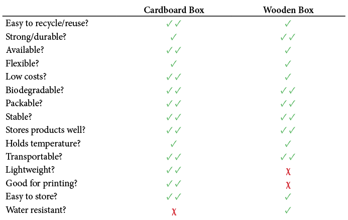
Having this table in front of me really helped me see that the most beneficial material to use is cardboard boxes. Wooden boxes will usually be a bit more expensive than cardboard, and not as easy to recycle. Printing will be harder, they’re not so easy to store when not in use (cardboard can be folded), and is heavier to work with. We could assume Door to Door Organics will have access to wooden boxes through the local farmers etc., but cardboard boxes are usually more available.

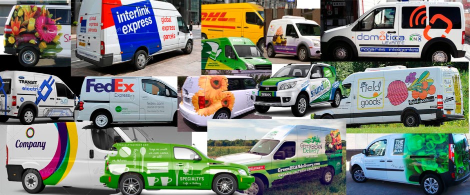
Besides, cardboard boxes are what the US based company uses, and it’s also what all the competitors I have researched use. Therefore this seems to be a good winner, with its week points at not being water resistant (should be placed under a roof if left outside), it’s not very flexible, but there is room for some flexibility, and it’s not as strong, but should be strong enough to hold the products and be stored with other boxes during transportation.

Design

After deciding on my material, I had a look at boxes for inspiration in what content to put on this box, since this was not stated in the brief. I decided to include the following:

  • Logo (branding)
  • Website (QR code or text)
  • #joydelivered (company slogan)
  • Visual elements such as leaves and product illustrations
  • Box Type (1-2 people or Families of 3 or more) illustrations

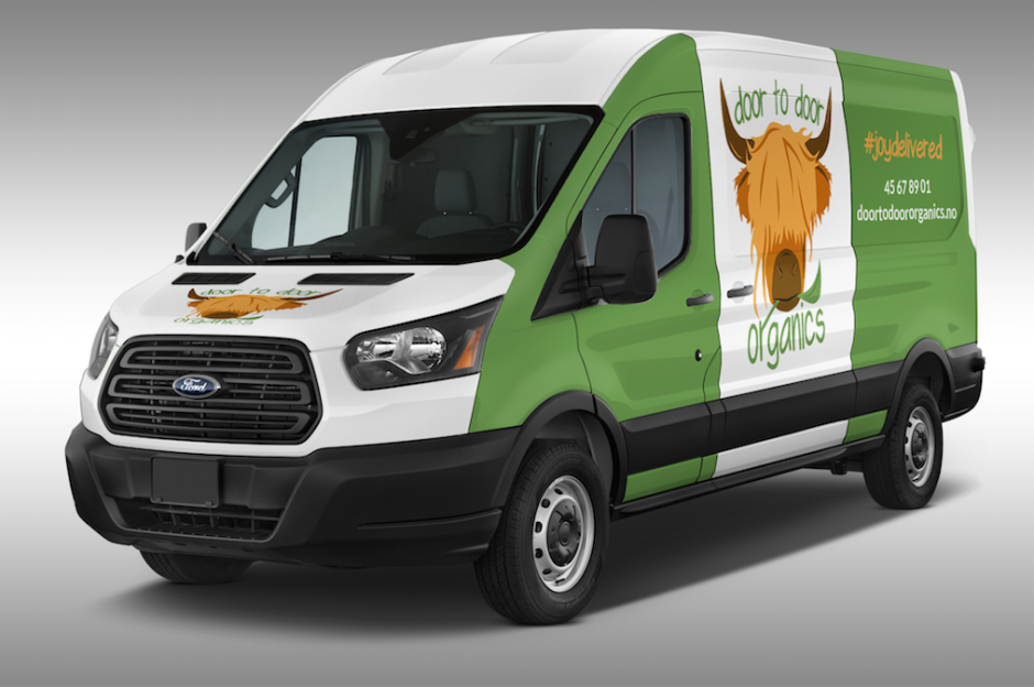
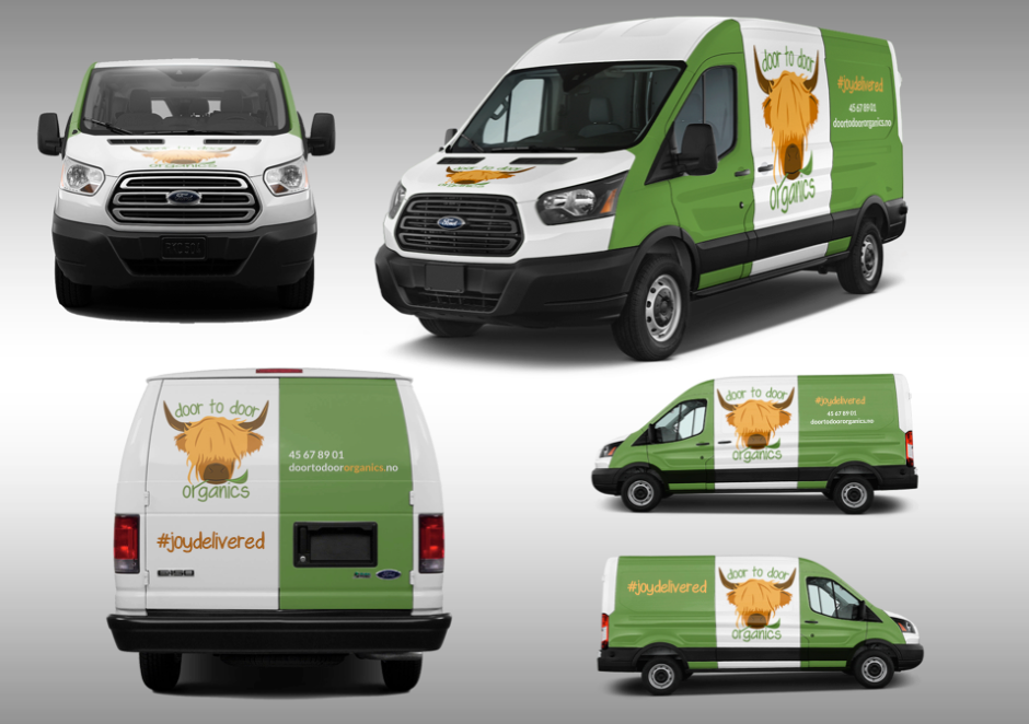
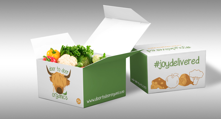
I wanted to differentiate from the average cardboard box by making it white rather than brown; this is the colour I wanted the van to have as well, and would this way bind these together. Plus, this, to me, makes the company come across as more modern, which is something I would like to do.

Thinking of different cardboard boxes and how to fold them, I was first thinking of a box with a fold on the middle on the top, and did my initial sketches like this. I later changed my idea to having the top lid be one whole piece, and instead fold this into the box. This helped the design as I wouldn’t have to think of placing elements in relation to the folds, and I also think it’s nice because it lets you close the box after opening, in a hassle-free way.

This slideshow requires JavaScript.

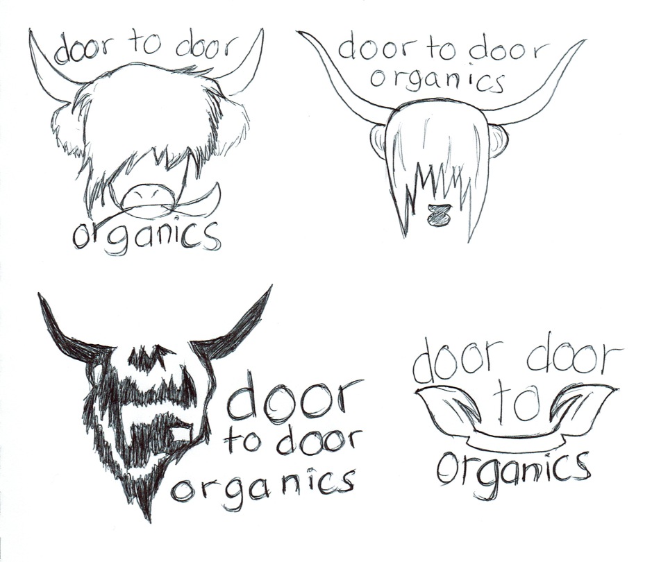
Before going over to Illustrator I did some sketches for the box type illustration I wanted to integrate. I found inspiration on Google, and also had a closer look at Door to Door Organics’ visual elements. That is what I ended up using for my main inspiration; the “Joy Delivered Guarantee” symbol shown on my Door to Door Organics moodboard.

CCI12062017

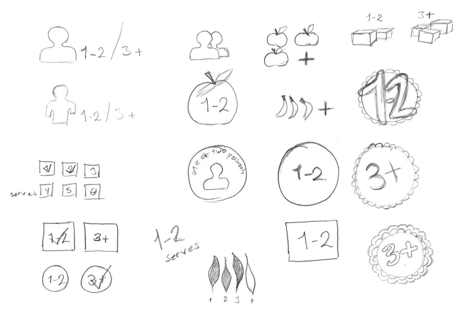
After doing this I digitized what I considered the best ideas, and also made some quite simple icons in Illustrator based on photographs of groceries. I found a few of each of the different types to show the variety of products. I then began trying to visualize my box ideas in Illustrator, making the die line and adding a bleed of 3mm.

This slideshow requires JavaScript.

My concern with this die line was the top, and so I ended up changing the box’s layout a tad.

This slideshow requires JavaScript.

I finally ended up making two slightly different designs. Most sides are the same, and all elements have the same placement on both boxes, however some colours and fills separate the two.

Box Mock Up1-2

Box Mock Up 3+


Until next time, stay creative,
Monika

SaveSave

Door to Door Organics: Designing Identity

Finally getting down to the fun stuff, I began more of my brainstorming and identity designing. Keeping the information gathered from my research and strategy planning in mind, I have started developing Door to Door Organics’ identity through sketches and ideas, starting out with a mind map and a moodboard.

Mind Map 2

Moodboard

After this I began working on what I reckon is one of the most important aspects of a brand identity; the logo. The US based company’s logo (see below) is, in my opinion, not very memorable. I think the sun around “to” reminds me too much of a kindergarten, and the other leaf like elements I’m personally not very fond of. So I knew I wanted to design a completely different logo. What I do like about it, however, is its colour scheme. This makes it come across as quite vibrant and happy, and there is great contrasts between the higher saturated orange and green. I also don’t mind the type of font, and figured I would find one that is similar, and also go with lowercase letters – this will bind the company logos better together.

DoortoDoor-Short-Stack-Logo-Trans-594x270

So the logo process began as always; with a few thumbnail sketches to quickly get ideas down. I soon had the idea of integrating a highland cow, as we have many of those in my hometown, and most people seem to think they are really cute. So I figured they really fit the whole concept of the company coming here.

After getting quite a few ideas down, I narrowed it down to my favourite ideas.

Sketch4

Going over to Illustrator, I used my sketches as a template to digitize the ideas and see what I might technically be able to come up with. I soon had seven ideas I was quite happy with. Four of the ideas use a highland cow as an icon, but the final three ideas remind me more of a butchery or something like that, so my favourite definitely was number 1. Design 4 might get women’s attention, but maybe not so much kids, and since I would like to appeal to them as well and have Door to Door Organics come across as more fun, design 1 ended up as the winner. The nice thing with this idea is that it really communicates something about the company, meat and leaves, and it’s really eye catching. I also think this is a memorable logo as it’s not very generic.

Door2Door

I ended up making two versions of the logo; the primary logo with the cow eating the “r” of organic, and a secondary logo with the text to the right of the cow. The primary logo is obviously the primary identity, but the secondary might be used on elements such as headers and letterheads (i.e. where there is more horizontal than vertical space). I’m also using a white outline when the logo is placed on a coloured background, and no outline when placed on a white, more neutral background.

This is a logo which should communicate at least the food part of the company, and it’s visually interesting. I made sure to balance the cow by having longer hair on one side because of the leaf, and I think there is just enough going on. Finally, it’s really cute, which I think will catch people’s attention.

Primary logo

Secondary logo

I think this logo really sets some basic guidelines in regards to the visual identity of Door to Door Organics in Levanger. It has a bit of a comic feel to it, which I really don’t mind as I think it fits the concept and definitely has the potential to reach a big part of the target group (kids). The font is simple, organic, modern, and in all lowercase. The colours are sampled from Door to Door Organics’ website, and therefore doesn’t completely change its identity from the US based company.

Visual Identity

Door to Door Organics’ visual identity in Levanger may be described as fun, simple and modern. It’s clean and organic (both in regards to products and the visual elements), and should come across as exciting.

Design and layouts – This should be as simple, yet engaging, as possible. Things should not be complicated, and the message should come across straight away. Don’t add unnecessary elements that don’t add anything to the appearance, but make sure to keep people’s interest and grab attention. Be memorable and unique, stand out from the crowd, and be a company people wish to check out.

Colour Palette – The primary colours are orange (#FFBA4D/Pantone 1365 C) and green (#799A52/Pantone 7490 C). To complement are a few other tones of these.

Typography – The typeface used in the logo is the sans serif script face “Swagger” and this will be the primary typeface for headings and shorter blocks of text. To go with this we will use the webfont Lato, which is the typeface Door to Door Organics in the US uses on their website.

Imagery – These should mainly consist of illustrations and some basic iconography. The style of these will be consistent with the style used in the logo, and should remember the colour palette and typography and complement these. Any imagery needs to be clean and organic, and easy to recognize as being part of the brand identity.

Next up will be the packaging and car wrapping, and of course the brand manual. Exciting!

Until next time, stay creative,
Monika

Door to Door Organics Strategy and Briefs

Having done my research, I went on to clarifying the strategy, and setting up two briefs. In Designing Brand Identity, A. Wheeler argues the first brief, the brand brief, to be “most effective when it can be captured as a diagram on one 11” x 17” page.” (p.120). On the other hand, “the creative brief cannot be written until the audit readout is complete and the brand brief is approved.” The point of this brief is to synthesize what the creative team needs to know (p.143), and should interpret the findings from the research stage.

Brand Brief

CREATIVE BRIEF

Contact Info

  • Door to Door Organics
  • 7600 Levanger, Norway
  • +47 4567 8901
  • levanger@d2do.no

Background and overview of Door to Door Organics

Door to Door Organics in Levanger wants to keep promising their clients satisfying organic and humanely-raised produce from local farmers.

Vision: Make people eat more organic groceries, and be more aware of what they eat – without the hassle of having to go into depth for each and every product they buy. With Door to Door Organics the consumer can rely on healthy and safe food.

Strategies: Intrigue families with kids so youngsters get accustomed to a healthy and clean diet from early on. Door to Door Organics should be the face of the local community’s grocery shopping, and should have a memorable visual identity.

Goals: Be the go-to business for door to door delivery and organic produce.

Values: Organic eating, healthy eating, clean eating, good treatment of any animals, clean communities, support of local farmers.

Target Group

Door to Door Organics wishes to reach everyone, but especially families with young kids. Everyone benefits from eating healthy from a young age, and Door to Door Organics wants to make even kids think eating healthy can be fun. Families interested in eating clean and organic food are of the main target group, and because of hectic schedules, Door to Door Organics helps the family spend more quality time together, without the stress of going to the shop.

Door to Door Organics is perfect for the middle class family with an average salary. With not overly priced produce, the different boxes will help keep the stress out of always coming up with a new dinner idea, while still eating healthy and clean food.

Women, especially mums, often pay extra attention to the business. Knowing their kids love the visual identity makes it even more fun to have them bring what for the kids are surprise boxes to the doorstep, and letting them play around unpacking. It’s like a healthy Christmas every week!

Door to Door Organics goals

Door to Door Organics should come across as organic and natural. Healthy. Green. Modern. Happy. Exciting. Lovely. Empathic. Door to Door Organics wants to tell people that eating healthy and clean food can be fun and easy.

What needs to be done – what are we designing?

We are designing a new visual identity for Door to Door Organics in Levanger. This includes developing a new logo, packaging for our products, and decoration on our delivery vans. In addition to this we need a brand manual to clearly set guidelines to ensure that we stick to the new identity and keep the brand alive.

Where and how will it be used?

The logo will be used both on printed material (stationery, brochures, vans, signs, uniforms, packaging etc.) and on screen (website, social media). The current touchpoints will be used on our packaging and vans.

Schedule

The full project needs to be done by the 16th of June 2017 (16.06.17).

Until next time, stay creative,
Monika

Door to Door Organics Research

Due Week 13, Friday 16.06.17 at 4 pm

For MA02 I need to develop a new logo and visual identity for Door to Door Organics. Since we’re focusing more on strategic design and the process of building a brand right now, I’ve put quite a lot of effort into the research to clarify the strategy for this assignment.

Door to Door Organics’ expansion to my local community doesn’t need as global research as a worldwide company would. I have therefore focused my research on the company itself based on their website, some competitors in the area and also countrywide, defining the problem, and the target group.

Client

The US based company Door to Door Organics says “Skip the store. Just open the door.”

Through this company anyone can do their weekly grocery shopping in minutes online, and have the food delivered right to their doorstep. The biggest plus; the food will be organic produce, farm-fresh dairy, humanely-raised meat, sustainable seafood, and natural groceries, all with a 100% satisfaction guarantee. Their “Smart Recipes” even take the stress out of deciding dinners.

Door to Door Organics is “dedicated to empowering people to eat food that has a positive impact on your health, our communities, and the environment.” (about door-to-door). The company supports local, organic farmers as this is good for the planet, they believe in strengthening our communities and economy, and donate time and money to support important food issues like GMO labeling initiatives. They “believe organic food is better for our health and the health of the planet. Organic produce is grown without the use of harmful pesticides and herbicides.”

d2d

Competition

I had a look at three companies that deliver food on the door.

Økomat – The first business I researched was “Økomat,” which is a local business with the same concept as Door to Door Organics. Økomat delivers organic food for health reasons and because they are thinking of our environment and communities, they support local farmers, and make sure all their partners raise animals in a humanely way. Økomat has an online shop from where people can book their order, and one is able to choose between a wide variety of products. They also have specific boxes one can buy, such as breakfast boxes, fruit boxes or dinner boxes – and these will then be brought to the customer’s door.

Adams Matkasse – Adams Matkasse tries to give their customers local produce when possible, but also expands to other areas of the world to get the “best” produce of the current season. Their goal is to help making families’ day-to-day life easier, making sure dinner is on the table every day – and uniting the whole family. Adams Matkasse is trying to appeal to parents, and talk a lot about their kids, their health, and their food habits. As Økomat and Door to Door Organics, this business also lets you order online and then have the food delivered right to your door.

Godt Levert – More than 50 000 families in Norway use Godt Levert; yet another business that lets you book online and find the food on your doorstep. Godt Levert was established by three men with busy lives, and the company focuses on healthy, good dinners and recipes.

Define the Problem

Since Door to Door Organics is expanding, and moving from the US to a small community in Norway, they need to develop a new logo and visual identity to suit new customers and markets. The visual identity also includes making touchpoints such as packaging and car decoration, as well as a brand manual to make sure the visual identity has set guidelines that will be followed.

Target Group/Consumer Profile

Based on Yelp reviews, it’s fairly obvious that women outnumber the men; at least as far as reviews go. What seem to be the main reasons people use the company are that 1) they have a busy schedule, e.g. combining work and having children, 2) they are disabled and getting to the shop is a little challenging, and 3) at winter time people are glad they don’t have to drive on the icy roads.

Door to Door Organics’ target audience are families with young kids. The parents, and especially the mums, want their kids to eat healthy, and they like the idea of supporting organic and local food. Because of busy daily schedules, getting to the shop, planning dinners and all that goes with it sometimes gets to the mum. So instead of dragging the hyperactive kids with her to the shop, it’s easier to go online, and have the food delivered right to the door, and let the kids have fun unpacking. It’s also nice that when using Door to Door Organics, they don’t have to spend time finding out what food is organic and not; this is all taken care of for them.

The average buyer is in her 30’s, and her kids are still quite young. The family belongs to the middle class, and has an average salary.

Until next time, stay creative,
Monika