Due Week 39, Friday 02.03.18 at 4pm
More than halfway through this project exam period, and almost done with the TimeTrack project.
Tuesday, Wednesday and Friday
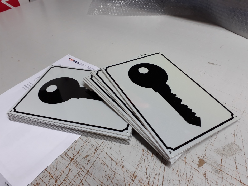
During the “regular” work days, I worked on a few diffrent projects, such as continuing some of the projects from last week, and also making a few new signs for businesses. We were also contacted by a graphic designer in Bergen who needed help creating signs for a building, both outside and inside, so I set up suggestions on sizes of these and asked our contacts both in Norway and abroad for prices.
The most fun and creative task of the week was to come up with a design for suitcases that will be used at the Beat the Wand convention in the US by local magician Boje Hoseth and his son Brian.
This slideshow requires JavaScript.
Monday and Thursday
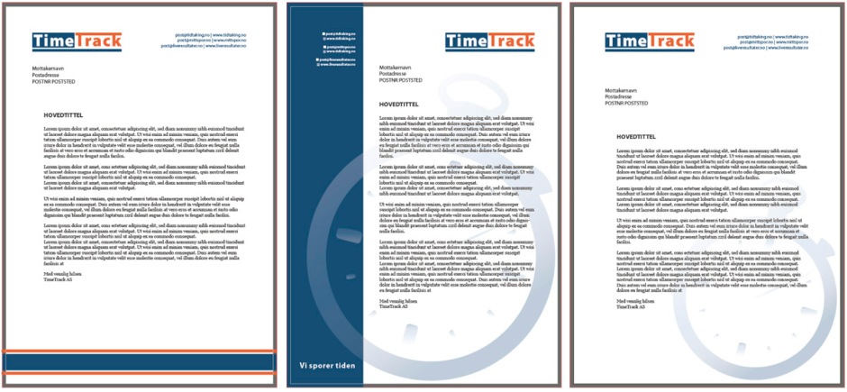
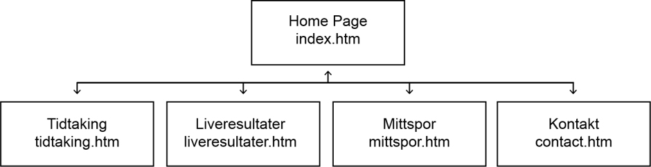
This week’s focus were the website profiles for the three websites operated by TimeTrack. Since TimeTrack (tidtaking) is the “main service” and “big brother” of the two other services, the purpose of the tidtaking.no site will be to quickly explain the company and all its services. It should also let the visitors easily get in touch with them, through a contact page. So after talking to my clients I set up a simple sitemap to visualise the pages needed.
When building this site and its content we discussed the questions “What is TimeTrack? Why does anyone need to know? What’s in it for the visitors?” as Designing Brand Identity (p.152) states that a website should always answer these questions quickly. Further, the book explains that characteristics of the best websites are that they are easy to use, they meet the visitor expectations, and communicate quickly.
In the end the content we had were simple descriptions of the services, as well as photos and contact information. We talked about either integrating the websites of liveresultater.no and mittspor.no on the site as “iframes”, or use clickable images that would take the users to the specific pages in a new tab.
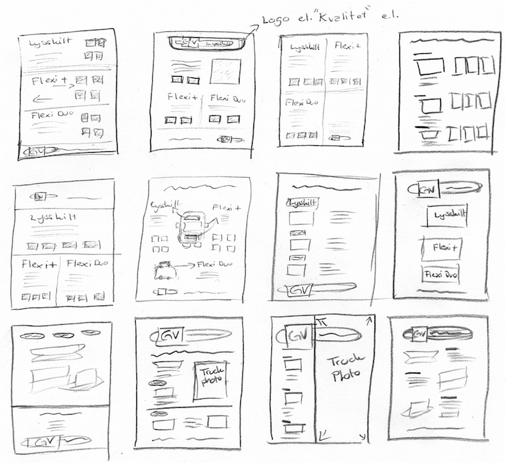
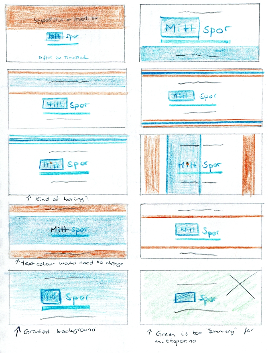
Then came the sketching of the site, where I first began with the index page, since this will be the first page visitors usually meet, and thus be engaging enough to keep people’s attention.
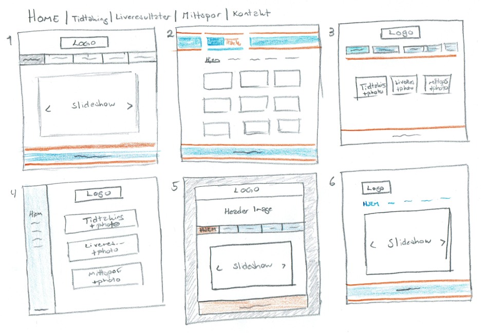
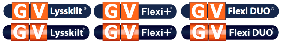
Out of these ideas we agreed to use the logo as seen in e.g. idea 3, a header image as seen in idea 5, the menu as seen in idea 5, content as done in idea 3 or 4, and footer as in idea 2 or 3. And with this in mind I put these ideas together to further build the site structure.
This slideshow requires JavaScript.
After this I moved my sketches over to Illustrator to better visualise and see what would work.
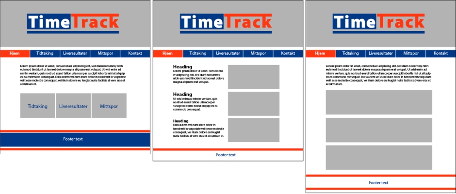
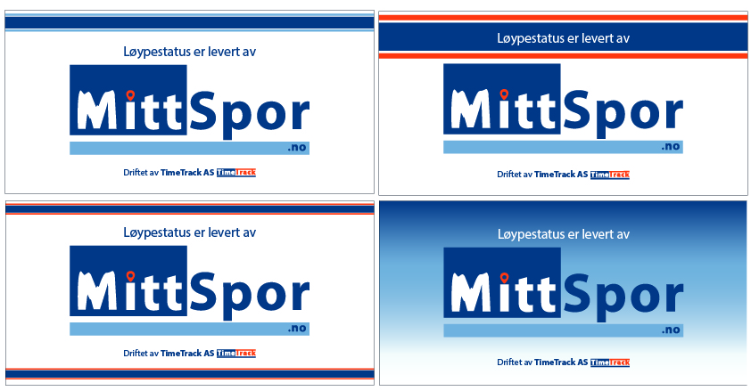
We were first quite certain on placing the logo on top of images, but realised we would either have to fade the photos quite a lot for this to work properly, or add a stroke around the logo. So we tried out some other ideas; the idea of using the logo on top was an earlier favourite, but it seemed to disappear a little – we therefore looked back at one of the first ideas and decided to integrate the logo with the TimeTrack stripes. The idea here was to have the logo start in line with the content. So we tried out this layout for all pages.
This slideshow requires JavaScript.
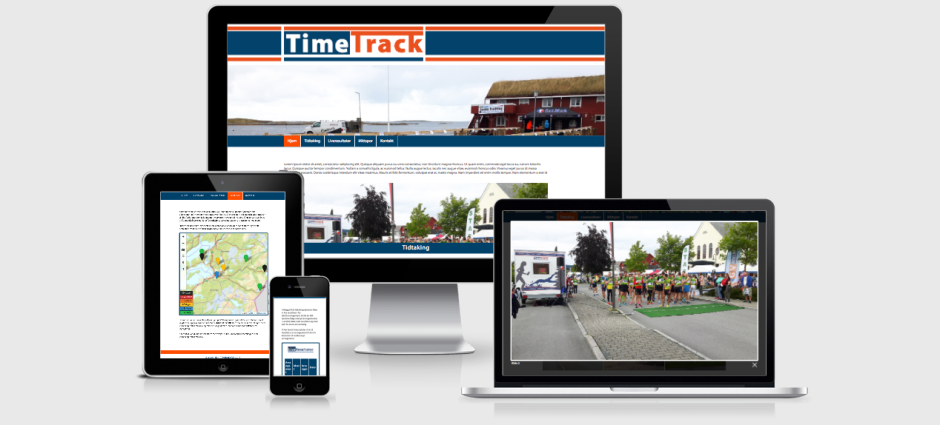
Landing on this design it was time for me to start coding and making a prototype. The plan for all websites was that I would either make mockups or prototypes, and let TimeTrack do the coding on their actual sites – especially on liveresultater.no and mittspor.no this was quite vital since there is so much information already existing on the sites. Still, I decided to build the TimeTrack site with HTML and CSS, from scratch. This process will be described in the report.
Liveresultater.no – Before beginning this project, TimeTrack told me they have earlier tried changing the design of this website. However, because people are used to the site structure, some users complained as they didn’t find everything where they expected it. So we agreed not to change the site structure of this, but merely set up a new design through colours, mobile responsivity, fonts, adding logo and a footer etc., to better fit the brand identity.
When starting this task I went to the site and “inspected” it to see how it was built. I then did some simple coding in my browser to see what was possible, before I went over to DreamWeaver to start building a simplified version of the site on my own.
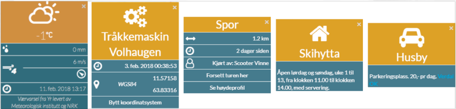
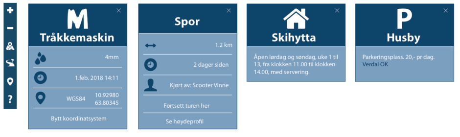
Below is my first idea – however this did not get the look or feel that I wanted, especially with the TimeTrack stripes at the bottom. So I removed the border around the page, and changed the stripes to the two hues of blue instead, which definitely fit the desired mood better.

The content of the original site updates regularly during a competition; what I have done is to use “static” content, so this is only a simple prototype of the site.
When coding this site I learnt more about tables, and also made the tables used more mobile friendly. The way it was before, people would zoom and scroll back and forth to see the content, which is not ideal at all. After my coding however, the table is a lot more user friendly, but still maintains the site structure people are used to.
Below is the website design before and after. I definitely think this is a great improvement, especially as the site now is a lot more responsive and actually adapts to the screen size used.
This slideshow requires JavaScript.
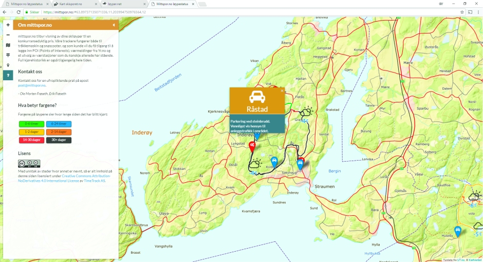
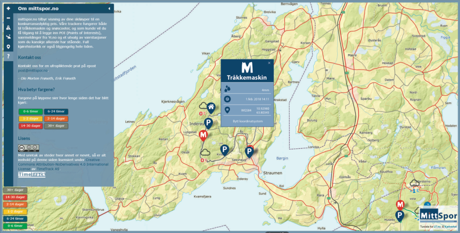
I have started looking at mittspor.no, but will finish the work of this site (and the TimeTrack project in whole) tomorrow.
Until next time, stay creative,
Monika