LA Semester 2

32: Create a WordPress Theme

I don’t believe I’m completely wrong in saying that this might be the very last learning activity at my first year of Noroff. But to be completely honest this activity also felt quite overwhelming throughout the whole work process. After a lot of trying and failing however, I have set up a new database (called activity) through my localhost and MAMP. I then built the theme in Dreamweaver, before doing a 1-click-WordPress install via one.com to publish the site: exported the content from my localhost, and added my theme. The website can be found here.

So, I have created my own very basic WordPress theme (from scratch, and this Lynda tutorial helped me a lot in doing so), and customised it a little. I haven’t put too much work into all the css-coding in this simply because the whole activity became a little exhausting. We have learnt quite a bit about html now, and I feel fairly confident in this topic – however, with WordPress it’s mainly php you have to work with (in addition to css), and I don’t feel I know as much about this. So this is definitely a topic I will need to focus more on and learn more about – even though it leaves me frustrated now and then, web design has turned out to be much more fun than I first thought.

I did, however try to add the hacks mentioned in the lesson for this week. I’m not sure how/where you can see all of them in use (like the one that will “Detect Safari on iOS” for example), but at least I have added all the hacks to my functions.php file. I found a random favicon to add to the site, and I changed the excerpt count to 15 just to show that I did understand the concept of how this one works. I simply used the same feedburner URL as given us in the lesson since I don’t have one on my own to replace it with.

(more…)

31: Customise a WordPress Site

This week’s learning activity we had to customise a WordPress site/theme. I started playing around with a child theme already in week 30, but I think that only benefit me for this week as I then already knew where to start. The theme I’m working with is “Hitchcock” by Anders Norén. This theme is described as “a minimal portfolio theme for designers, photographers and other creatives. It features a beautiful responsive design, a social icon menu, Jetpack infinite scroll, custom accent color, custom header image, support for gallery post format, editor styling and much more” (WordPress).

To compare my design with the theme as it was, check out this website.


This slideshow requires JavaScript.

In short, the changes I have made to the design are the following:

I imported the web font Mirza and used this for headings and blockquotes. Myriad Pro is used for body copy. A light and a dark blue have been used to colour headings, buttons, etc. The blog’s width is changed and so is the content’s, search field is removed, and the social menu bar is moved to footer. I think these changes have customised the website quite a bit. And adding a few plugins has in my opinion made this look like a pretty neat portfolio.

Read this for a more thorough explanation.

Until next time, stay creative,
Monika

30: CMS and WordPress

The last week at Noroff of 2016, and I don’t think I have ever struggled this much understanding any of our learning activities before. I thought I had a decent understanding of web coding etc. after some of our lessons, but as we dive deeper into the subject I realise just how much there actually is to learn. Downloading and installing WordPress was an alright process after finding this video on YouTube. Understanding the connection between WordPress, Dreamweaver and my hosting account on One.com however, was a long process I eventually had to sleep on. But I made it in the end, I think.

I then chose the WordPress theme Hitchcock by Anders Norén, and did a few rather simple adjustments to it – both in WordPress, but I also tried doing a few changes in Dreamweaver by making a child theme. Not sure if we were actually meant to try this already since we haven’t learnt much about it yet, but there were a few things I wanted differently. This video was of great help for understanding how to create a child theme.

Anyway – since I thought it was about time, I made myself a logo as well. Its symbol is based on a tattoo idea I’ve had for a while, and I just wanted something simple that was still a bit elegant and fancy. The colours I think suit me well, being from cold Scandinavia. And I wish to base the design of my portfolio roughly on this theme.


This slideshow requires JavaScript.

Visit the website here.

Looking forward to starting the holiday now, although I do believe I’ll need to do some work on the second part of MA5, as I still have a few things there that I need to do. But Merry Christmas to everyone anyway!

Until next time, stay creative,
Monika

29: Point of Sale

Finishing off this four week project, we had to create a few point of sale elements this week, as well as setting up a brand manual for our brand.

Part A – Point of Sale Elements

When making these elements we had to consider the brand in general and its design before designing a set of point of sale elements to promote the product in-store. We were given the freedom to choose how many elements, and what kind of format we wanted. The elements had to shocase the actual product, integrate well with the brand’s look and feel, and persuade customers to buy the product.

As with the other products, my thought process began with sketching thumbnails. I thought of the different formats I could use, and chose a couple that I feel would fit the brand.

With my design from other products in mind, I chose text, layout and elements to work with my point of sale elements. I decided to go with a horizontal and a vertical banner. The horizontal is to be placed on top of shelves or hanging from the roof, with one unique design on both sides. As for the vertical, there are two different layouts: they both have the same front, but unique designs on the other side, with more information. These are meant to hang on the side of a shelf, or in a slightly larger size from the roof.

(more…)

28: Packaging Design

This week’s task has been to design the packaging for the dog food product. I have decided that my product is dry pellets, which means that its form is solid and I don’t need to make the packaging out of waterproof material. I would like it to be easy to open and close this bag since it’s meant to last for a little while, so I need to make sure it’s easy to store. It needs to be strong, since I’m thinking it should be about 5 kg. In making the design we of course had to consider the other products we have already made, to make sure they integrate well with the brand identity.

Exploration –  Use sketching techniques to draw thumbnails and hand in your thumbnails as scanned PDFs.

I did a few thumbnails for both different packaging formats, as well as the design when I had chosen the type of packaging I wanted.

Brand Integration –  Choose one of your thumbnails and refine your design. Place it next to your brochure and logo and see how you can merge your design with the brand identity. Also, what fundamentals of the brand can you draw from and use in your design? Hand in a picture of your thumbnails, mock-ups, logo and brochure together.

(more…)

27: Illustration, Infographic and Brochure

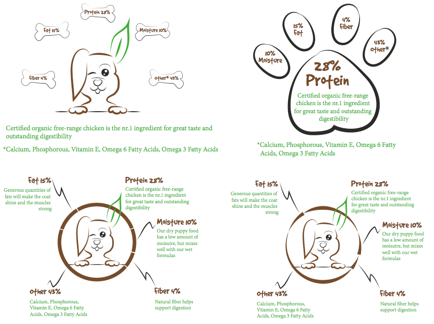
The second part of MA7 was to design a brochure for the dog food product. This brochure has to contain an infographic illustration using fictitious data. It must display the nutritious value of the food, and give an indication of consumption per size of dog. The purpose of the brochure is to introduce the product and the infographic, and it has to complement and blend in with the logo.

After adding a few words to my mind map, I began sketching.

Nutritious values

I then tried out the best ideas in Illustrator, to see what they might look like.

screen-shot-2016-11-22-at-19-19-21

Because of the feedback I received on these four, I chose the one in the bottom left corner and did a few changes to this before I got the result I wanted. The design of this is quite simple; it uses the sans serif font Myriad Pro for the body text and the logo font for headings – which again display the different values well. The lines going from the circle to the headings are also in relation to the logo, with the black lines being made out of the mountains.

(more…)

26: Create A Logo

This week we got our MA7: Branding & Packaging, but “due to the scale of this assignment, these four weeks are to be considered a project period where the learning activities all come together to form the Mandatory Project.” So the first task, for this week, was to first of all develop a name for the dog food project we’ll be working with.

I decided to call my product Natural Puppiness. My target group are young people (in their 20’s) who just bought their first dog (a puppy), and who enjoy taking their puppy outside with them. They are interested in giving their dog the best food; food that gives them energy to play outside, and that will keep them helathy (organic food: natural). UrbanDictionary’s definition of the word “puppinees” is: “The feeling of unbearable joy brought on by the appearance of puppies. A fluffy, happy feeling of adorable joy from the undisputed masters of cuteness, puppies…” I also would like to think the word can translate to a puppy “in happiness.”

After coming up with a name, we had to design a logo for the product, using full colour. This logo has to consist of a main visual, and typography, and in creating it we had to follow four fundamental steps, in a particular sequence. Before I started I also made a little mind map for the logo. Puppy (Cute, Young, Energy – Playful), Colours (2-3, green, brown, black, high saturation), Symbol (Puppy face, Paw, Nose), Typography (Name, Organic), Happy (Cheerful) are the words I put down.

Exploration – Use sketching techniques to draw thumbnails and hand in your thumbnails as scanned PDFs.

Focus – Highlight three of the thumbnail ideas that you consider the best options and state why. Hand in an A4 with visuals of the three chosen thumbnails; include reasons for choosing each of these three options.

(more…)

25: Market Your Website

As we’re learning this week, it is important to have a real strategy to campaigning one’s website. It simply isn’t enough to just make the website and expect people to find it on their own; you need to market it and make it easy for people to find. In this week’s learning activity we have to consider how we would do just this, with a budget of both NOK 10 000, and NOK 20 000. I continue using my Bakery website (MA 05) for this, and since that is meant to be a bakery in the UK, and Amesbury to be more specific, I have focused on this area.

Research on advertising costs

  • Wiltshire Times – It was really hard actually finding prices for ads in this newspaper, but I did find their mini banners to cost £180 (NOK 1800).
  • Facebook ad – The nice thing about Facebook is that you can decide how much of your budget you want to spend, starting at $1 (NOK 8) per day.
  • Independent Online Ad – A so-called Leaderboard costs £40 (NOK 400) for a CPM ad (the cost for 1,000 impressions, or views of the ad).

Budget of NOK 10 000

  • Mini Banner in the Wiltshire Times – NOK 1800. Amesbury is located in Wiltshire, which is why I’d contact this newspaper. They should hopefully reach out to the audience closer to the bakery.
  • Facebook ad – NOK 5000. Since my target audience is around 18-35, I would expect many of them would be on Facebook, and I would therefore like to spend a considerable amount of money on ads here.
  • Independent Online Ad – I’d spend about NOK 1200 on the online ad in the Independent.
  • Business Cards – NOK 440 for 1000 cards, printed by Vistaprint.
  • Flyers – NOK 494 for 1000 A5 flyers, by Vistaprint.
  • Gym website ad – Finally I would spend the rest on e.g. Body Works Fitness Studio in Amesbury, and ask to put an ad on their website, (as well as leaving flyers around there).

Budget of NOK 20 000

With double the budget, I would probably first of all spend more on some of these ads.

  • Facebook Ad – NOK 6000.
  • Wiltshire Times – I couldn’t find out how long the mini banner would be used for the amount of £180, but let’s double this, and spend £360 (NOK 3600) on this.
  • Independent Online Ad – NOK 2000.
  • Business Cards – NOK 440 for 1000 cards, printed by Vistaprint.
  • Flyers – NOK 494 for 1000 A5 flyers, by Vistaprint.
  • I’d then get a few more marketing items – the prices below use rate examples from Vistaprint.
  • A1 Posters – NOK 1863 for 20 posters.
  • Car Stickers – NOK 624. I’d give these to the employees, so they could market the website while driving around.
  • The remaining NOK 5000 I’d spend on a big blogger focusing on health and healthy food.

Viral Idea

Since my bakery offers healthier snacks, I would do my viral idea campaign at a gym. I’d then have members of the gym in both genders, and particularly between the age of 18-35, exercise before all meeting up, fighting for the last chocolate ball(s) after the workout. And the “losers” would go to the less healthy chocolate, seeming very unhappy and disappointed – while the winner(s) are very pleased.

Until next time, stay creative,
Monika

24: Coding Basics

We continued with web design this week, and were asked to convert the website used in two previous LA’s, to HTML and CSS code. Since I used my bakery website for the earlier activities, I did that now as well, getting a little started on the second part of MA5 at the same time. I have never done much coding before (apart from some rather simple coding on a personal blog), so this was something new for me, but I was surprised by how easy some of it came. The videos I’ve seen on Lynda.com have definitely helped me a lot. And even though there will be made quite a few changes still, and I only did 2/4 pages for this activity, I’m rather satisfied with how similar it looks to the front-end design.

This slideshow requires JavaScript.

Looking forward to learning more about coding, and seeing how I can improve this design!

Until next time, stay creative,
Monika

23: Planning the Structure

For this week’s Learning Activity we had to “Create the structure of your web page in terms of HTML files and folders.” We were to use the web page we did the briefing form for in an earlier Learning Activity, and since I used the bakery website (MA05) for that, that’s what I’m using now as well. So the idea was to set up the structure so that I’d be ready to code this website. We had to do this by pen and paper first before doing it digitally.

Since we’re handing in the first part of MA05 this Friday, I’m starting to have a quite clear idea of what I want on the different pages etc. now, so it was fairly easy to set up this structure with the front-end design in front of me.

Until next time, stay creative,
Monika