Semester 4

Report – Finished Portfolio 4

For the fourth and last semester our portfolio had to include the three Mandatory Assignments from this semester, and the reports for these. So my portfolio consists of a website, a poster and photoshoot for an awareness campaign, and a motion design title sequence.

This semester’s assignments have been fun, exciting, demanding, and inspiring. While working on each assignment I have gained a deeper understanding of the work that is put behind any design we see, and how visual elements and an identity are important factors for a brand and in design in general.

I have kept building my own design identity, and believe this today is a lot stronger than prior to this semester – yet still keeping an open mind to approach other styles and looks. Working with web design, photography, posters, iconography and motion design has broadened my knowledge in different ways of successful communication. My skills in Illustrator, Photoshop and After Effects have improved a lot, and this again has made my work process more effective and the end result more desirable.

My interactive portfolio presenting this semester’s work can be found on monikarh.com/portfolio4.

This slideshow requires JavaScript.

Portfolio Design Choices

The portfolio is meant to represent me as a designer, so I decided to make a rather minimalistic design. This is something I’ve been drawn to since I started my degree in graphic design, and does remind me of my Nordic roots. In addition to black and white, the blue colours in use are based on those in my logo. The font I used for headings is Mirza, which is the font used in my logo. To go with this I’m using the font Open Sans.

My one-page portfolio website is built from scratch, using HTML and CSS. Since this was a website that would not need updating very regularly, and it would not be a very complex one, I figured I might as well do all the coding on my own, rather than using WordPress. I believe the design of the website displays my portfolio work well, as I have very clearly separated the different assignments with a small change in the background colour. By adding a menu to the top, it is also easy to quickly navigate to the assignment of interest.

The portfolio should come across as organised, minimalistic, and easy to navigate. Because of the little use of colours, there isn’t too much going on, which lets the viewer focus more on the actual assignments – which, of course, is the main purpose of a portfolio. I also let the layout of my reports be inspired by the website, and have displayed each of the individual reports almost as if they were a page on the website itself.

– This is an extract from my report, and the whole assignment can be read here: REPORT 

Stay creative,
Monika

REPORT – FINISHED GDH WEBSITE

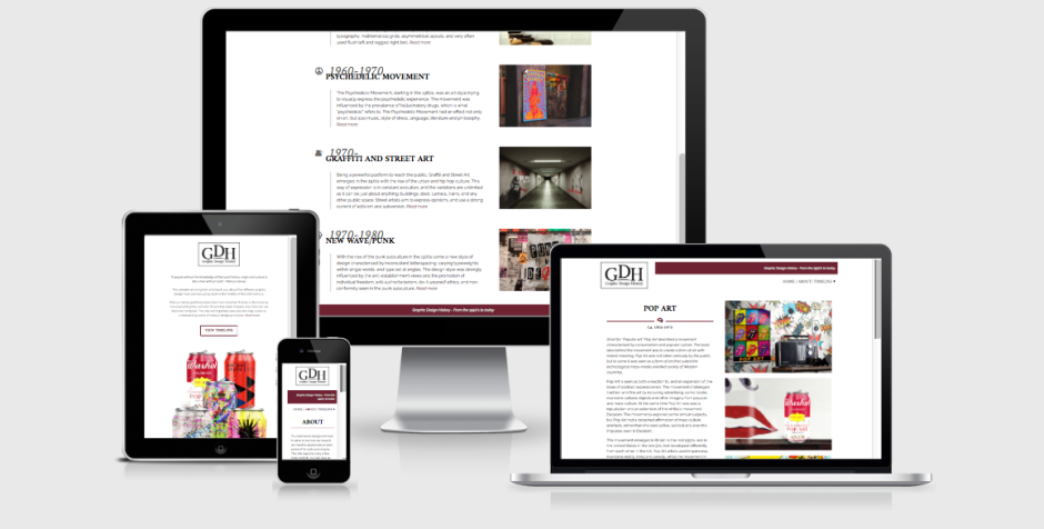
When making the design for this website I have tried making it as simple and minimalistic as possible, yet still keeping a modern and interesting look and feel. It utilises a two column layout, and white space has closely been considered.

The purpose of the website is to display five different style periods from the 1950’s to today. It should be easy to navigate, and relaxing for the eye, not have more elements or text than needed, and strong imagery.

Visit the website here.

Responsive

The website I have designed is one I’m very happy with. I think I managed to create exactly that mood I was aiming for, and in my opinion this is a site people can easily interact with, and learn about the different style periods from. The overall design with its elements, imagery, colours and typography looks good, and should manage to engage people.

I believe I through my research and planning managed to plan out the site well before starting the coding. This got rid off most of the technical issues I could have run into, and let me plan out classes and id’s well from the start. All of this has made my coding process a lot easier – and thus a lot more fun as well. Google has been one of my best friends when coding, as people have discussed HTML and CSS codes before me on countless forums and threads, as well as videos.

The design is in many ways very similar to what I first had in mind from some of my sketches. The changes I have made since then have only improved my design, both in terms of the visual design, and also the technical issues. What has been my biggest challenge probably is to keep it as simple as possible, whilst also making it visually interesting. I have had to consider what elements and images would draw the attention of the viewer, and have had to work around that. This is something I feel I eventually managed to do with the design as it is.

I think this assignment has been very interesting and fun to work on. It was a quite open assignment where I was able to decide a little myself what I actually made (content), and that is something I think has been very fun. Making all the imagery myself was both challenging and fun as well as a good way for me to learn more about the characteristics of each style, so I’m really glad I decided to do it this way.

– This is an extract from my report, and the whole assignment can be read here: REPORT –

Until next time, stay creative,
Monika

SaveSave

REPORT – FINISHED TITLE SEQUENCE

In this assignment I have made a title sequence to kick off the Diamond Awards show in 2017. In doing this, the layout, typography, colours, elements, and animation have been very important to consider. The title sequence should convey the concept of the mood of the evening, and should appeal to the target audience.

I’m surprisingly happy with my final product. I think it really came together in the end, and the effects, transitions and animation in general work quite well. There are of course transitions etc. that could have been improved had I known my way around the program better, and the way I have done certain animations could probably have been done in much faster and more efficient ways, but I made it work without too much hassle. And that’s what is important in the end; achieving the look and feel I want, and seeing my ideas working out together.

Starting out with this assignment I had no inspiration at all. It was hard coming up with ideas since I had never worked in After Effects prior to the project. I didn’t know what I would be able to do at all; I had some ideas, but didn’t know if I would be able to go through with them at all. But once I managed to get started with some sketches, vectorising ideas, and finally starting animating I got much more excited.

I have used several videos and tutorials to help me, but I have also spent a lot of time just trying out things. Using solids to have objects appear in certain ways/areas has been very helpful, and this is how I ended up finding out how to make the “Film Production” text turn white outside the icon. There are probably other ways to achieve this as well, but I found this to work for me. All in all I’m happy with the way I managed to handle the program.

– This is an extract from my report, and the whole assignment can be read here: REPORT –

Until next time, stay creative,
Monika

Report – Finished Awareness Campaign

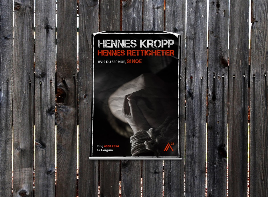
In this assignment I have created a poster as an awareness campaign for A21 Norway. When doing this I also did a photoshoot. For the poster I needed to closely consider the photography, and a lot of planning had to be done prior to using the camera at all. I also had to come up with the text to include in the poster. The poster is strong in its contrasts, has elements and a slogan to quickly draw attention, and is comfortable to the eye.

Poster mockup

I’m happy to say I am very happy with my finished product; including the planning of the photoshoot, the shoot itself, and the final poster a s a whole. I love the colour scheme used, as it’s harmonic and visually interesting. The hues work great together, and are consistent over all text, elements and the photographs. All typography is also legible and there shouldn’t be much confusion as to what the poster is about.

Even though it is quite simple, I personally believe the photograph in the poster is so strong that this is not at all an issue. It would get attention as a poster. The other photos from the shoot are also visually appealing and interesting to look at.

My process has in my opinion been very thorough. Before doing any designing or taking any photos, I did both research and planning as per the brief.

Having such a clear idea from the beginning, I think developing the poster has gone much smoother than it could have, had I not had a very thought through idea. I always knew which fonts and colours not to use. Since photography was also one of the key elements in this assignment, this is what I focused on the most, and feel fairly confident in having achieved well.

– This is an extract from my report, and the whole assignment can be read here: REPORT 

Until next time, stay creative,
Monika