WEBP

Report – Finished WEBP

Today’s submission also marked the end of my first year here at Noroff. I have to admit it feels great; especially after a rather hectic project period.

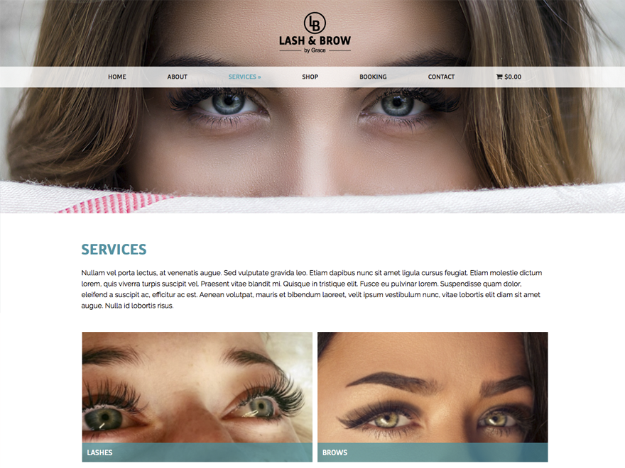
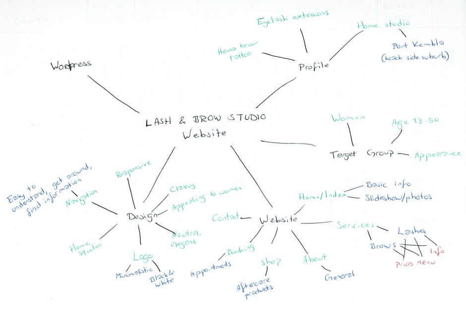
For my Project Exam I have designed a website for Grace Hanna in Lash and Brow by Grace, Australia. This five week period has included project management and development, dealing with a client, developing interactive graphic design, working on a low budget, and conceptual development. Finally it has resulted in a responsive website on which the studio’s clients can buy products, book appointments, find information, and get in contact.

Lash & Brow by Grace specialises in semi permanent eyelash extensions, henna brow tattoo, and permanent tattoo using PHI brow method. The studio’s target group are women aged between 18-50, and thus the website would need to be appealing to this group.

Visit the website here (I’ve only uploaded it to my subdomain so far, as we didn’t get the web hosting ready and done before the assignment’s deadline).

screen-shot-2017-02-24-at-10-51-12

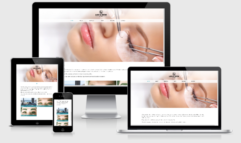
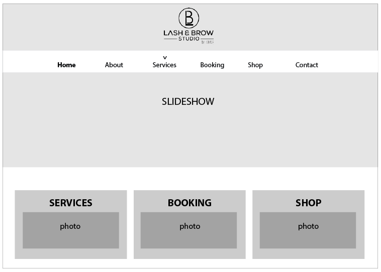
I consider myself very happy with the finished website, as it in many ways is almost exactly how I pictured in when creating the final wireframe. The biggest difference from this is the footer that was later added, and this choice only improved the site’s appearance.

My process has been long, a little challenging, and also quite fun. I definitely think it has provided me “with practical skills and knowledge in tools used for working with graphic design focusing on screen-based media,” as our assignment brief said.

It has been exciting to see the site grow, and to see how small changes actually make the biggest difference. I have also tried challenging myself by trying to do things that needed some serious thinking and researching (e.g. placing the navigation menu on top of the header, and using the slideshow on the home page only), and am glad to see this has worked out well.

Through this project exam I have learnt better how to work with a client, achieved more skills in project management and teamwork, developed interactive solutions for screen-based media, and learnt more about blog tools. Most of all though, I have improved my web design skills in using CSS in particular. I believe this project has taught me much about WordPress, and I personally think my child theme is very different from my parent theme, and is thus rather original work made by me.

– This is an extract from my WEBP, and the whole report can be read here: REPORT 

Until next time, stay creative,
Monika

Week 4: Checking the Website Online

I’m so happy today after seeing I got an A on my WEBM! Seems like all the hard work from this semester has paid off, and I could not be happier. But, back to the WEBP, and the final project of year one. My schedule for this week said I had to finish the coding, and check it online – which is exactly what I have done. It’s been really fun to see that my schedule has been quite accurate and spot on throughout the whole project period so far.

Since my client doesn’t have the hosting ready yet, I uploaded the website as a subdomain on my One.com account to check that everything was working properly. I then of course found an issue with my booking form, so after a lot of annoyance I finally found a different plugin to use. The first one turned out to have a limited amount of service selections, and since we need quite a few I needed to find one that didn’t. This was really annoying to find out though, since I had already been coding the first booking plugin – but luckily it didn’t take too long to find a new one and I didn’t have to do that much coding on that one.

screenshot

We’re trying to create the website on a rather low budget, so I’m looking for plugins that are free, and I have found that can be really hard. Some look good at first, but then there are some problems with them after all, which can be quite annoying. But I’ve managed to create a website both myself and my client are very happy with, and only using free plugins.

After getting the website online I asked for some feedback on Moodle, and had a few recommendations to change. So among others I changed the body copy’s font, added a very simple footer, and turned the page titles back on – and I really think these changes made the design and feel of the website a lot stronger.

I’m still waiting for my client to send some more photos and text, and hoping she’ll get her domain ready by next week, but I’m confident I’ll have something ready to show for the submission on Friday. The subdomain site is more or less ready to go anyway.

Until next time, stay creative,
Monika

Week 3: Coding the Website

Yup, coding the website – that’s pretty much all I’ve been doing this week. And I’m so excited to see it coming along pretty nicely and (for the most part) the way my client wanted it and I agreed with. I’ve had a few annoying issues here and there and now and then, but I have managed to code my way through them all. Not going to upload too many photos of how it is right now I think, but I’ll describe most of the features I’ve added:

  • Slideshow in the header on the home page only
  • Unique header photos on the other pages (1 photo only per page)
  • Added a drop down menu
  • Found a quite good, free booking plugin that will benefit my client
  • Using WooCommerce to display some products for sale
  • Photo grids – to display photos as well as linking to certain pages
  • Added an interactive map as well as a contact form and social icons

Some problems I’ve had to solve:

  • The slideshow on the home page seemed impossible at first, but using my functions.php file eventually helped me get it set up
  • For some reason the logo would not align to the center of the page (and I tried many ways to get it done), but in the end I finally came up with a solution for that
  • My booking form would overflow the page if I changed to mobile or tablet view, which of course isn’t ideal, so with some coding and a few hacks I got that set up
  • I hadn’t thought it’d be very complicated to integrate social media buttons inside a page, but it turned out to be a bit more to it than that. I found a plugin though, which was pretty cool since you could add your own icons etc., and got that sorted out
  • The WooCommerce cart seemed to be working perfectly fine at first, but when I checked if it was responsive I realised it wasn’t all that great. It looked terrible at a smaller screen size; I thought I’d have to contact someone for help, BUT I was so excited when I managed to fix it myself, no Google or any other help needed! So, from left to right below. I might still make a few adjustments and make each sections a tad smaller, but I’m just so happy this worked out

There are still a few things I need to do, but I’m super excited each time I can check another thing on my list, and consider it done. Still waiting to hear back from my client regarding adding an extra colour or so (we’ve only been working with white, grey and black so far because of her logo), as I think that would add some more visual input and interest to the site. But if she wishes to include that, that’d be a fairly quick process to fix and change.

Until next time, stay creative,
Monika

Week 2: Wireframe and Planning

Week 2/5 is over, and this project is getting exciting. This week I’ve worked on, and finalized the wireframe for all pages on the website – of course together with my client. I first sent my client 10 ideas for the layout of the home (index) page, and let her choose which she wanted – or if she wanted a combination from a couple of the layouts I sent her. My client then chose one of those, and I began working on the rest of the pages.

design-4

This resulted in a few analogous sketches before I digitized the best ones and sent some ideas for the rest of the pages, for my client to choose. It’s really important for me that she ends up with a design and layout she wants, and that’s why I always let her choose from a few ideas, as well as making it clear that she can let me know if there is anything she’d like different.

(more…)

Week 1: Getting Stared

As week one of this five week project period is coming to an end, I can take a deep breath and be happy with the work I’ve put down in the assignment so far. After spending about 8 hours every day this week, doing research, talking to my client, planning the site structure, finding inspiration, and making sketches, I’m on schedule and excited about this assignment.

Mind Map

mind-map

(more…)

Project Description & Schedule

To finish the second semester and the first year as a Graphic Design student, I’m starting my Project Exam today. This semester, the project is interactive, and once again we were encouraged to find a client on our own. So I have chosen to work with Grace Hanna in Lash and Brow Studio in Port Kembla, Australia, and she is interested in setting up a website for her studio.

Business/Concept

Lash and Brow Studio specialises in semi permanent eyelash extensions, henna brow tattoo, and permanent (microblanding) tattoo using PHI brow method. Basically Hanna is a stylist focusing on lashes and brows. Today it is a one-person business in Australia, but Hanna will be looking to hire more staff in the future.

Profile

Hanna wishes to be portrayed as an eyelash extension/brow tattoo expert, working in an exclusive boutique style studio. Her home studio is located in the beautiful beach side suburb of Port Kembla in New South Wales. The techniques she models ensure a beautiful set of lash extensions with no damage to the natural lashes.

Hanna was recently trained by world renowned and famous lash artist Joy Crossingham (an internationally awarded master lash stylist) from Brisbane Lashes, and she will in the beginning of February be certified in permanent makeup (brow microblanding).
(more…)