Semester 1

Report – Finished GRAM

Our GRAM (Graphic Portfolio) had to include our four Mandatory Assignments from this semester, and the reports for these. In addition to this, I added a selection of my learning activities. So my portfolio consists of: photographs, a logo for a fictive chocolate brand, an illustration for a song, and a layout for a cookbook. From my learning activities I chose to include a book cover, a packaging label, travel brochure, and parts of a magazine. The book cover had focus on thinking of, and considering, the use of colour. The packaging label is meant to represent a juice with orange and banana flavour. And finally, my travel brochure and magazine were both created in InDesign – with layout and design as the main focus.

Even though I have still yet to really find myself as a designer and my own very personal look, I believe all these products somehow represent me as a designer, in terms of them having a rather modern, and maybe a little contemporary look.

Working on all these assignments has been an interesting journey, and I do believe I have learnt a lot. Over the last few months I have been allowed, and encouraged, to challenge myself as a designer, slowly but surely getting new knowledge and improving my artistic eye.

The assignments we have been given have always been interesting since we have had some freedom to give them all a personal touch, as well as seeming like what could be real life projects. Working with photography, logos, illustrations and layouts has challenged me to broading my knowledge to programs such as InDesign and Illustrator. These are skills I know I will take much use of later in life, hopefully both as a student but also as a designer.

This slideshow requires JavaScript.

GRAM Design Choices

I needed to make the portfolio’s design represent me as a designer, and with a rather minimalistic and simple design, I think I have accomplished just that. The background doesn’t disturb the design, and I believe the fonts work well. I have tried making my images and products stand out a little more by applying a drop shadow to them.

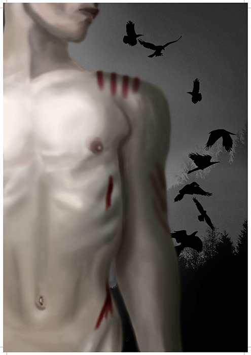
My background is a photograph I took whilst shooting photos for our photography assignment. It is a photograph of the ocean, taken with a long shutter, and I have later turned it to black and white. Taking photos and play around with them like this is something I enjoy very much, and is thus another way for me to represent myself as an artist.

The whole portfolio is well organised, and easy to navigate through. Because of the minimalistic use of colours, there isn’t too much going on, which lets the viewer focus more on the actual products – this, of course, is the main purpose of a portfolio. I have done my best to try and make sure the design and layout of the pages are consistent both in the portfolio part of the assignment, and also the part including my reports. This way I think I have really managed to bind the whole GRAM together, and there should be no confusion whether or not these two parts belong together.

– This is an extract from my GRAM, and the whole assignment can be read here: GRAM 

Until next time, stay creative,
Monika

Report – Final Photos

The first real Mandatory Assignment we were given was also the one we finished last, so for a few months I have brought my camera out with me quite a lot in order to get the perfect shots for the 10 topics we were given. I tried challenging myself in terms of shooting both inside and outside, as well as in both daylight and at night time. Finally, composition and an interesting element or object were important details for me to consider every time I went out.

Out of my final 10 photos, I chose the categories Drawing With Light, Freeze Water, and Golden Section for my final three images.

DRAWING WITH LIGHT

4 Drawing with light

Settings: f14 – 5 sec – ISO 100 – Focal Length 50
Elements: An empty bottle and a torch
Composition: Portrait orientated picture, with a front view perspective
Contrasts/Colours: Image with quite high contrasts, and the colours black, white and green dominate

This photograph was taken in a dark room, and with a rather dark background to avoid any elements that may disturb the photo. The bottle was placed on a table, and the camera on a tripod. I then used a long shutter speed (5 seconds), and using a remote control, I moved my torch from above the bottle and to the bottom whilst taking the photo.

The focus is on the bottle – the element – itself, and despite all the lines from the label, I believe it’s a rather clean image with a good focus point. It’s also interesting to look at, as the lines (from the torch, the label and even the edge of the bottle) sort of guide the eye around the frame.

I think the photograph itself is very interesting to look at, and because of what is still left of the bottle’s label, I even think the whole image kind of reminds me of the movie The Matrix. The colour green also helps emphasize this, and is something I find very interesting about this photograph.

If I were to change anything with this photo, I think I would try to make the bottle look even sharper by adjusting the aperture a tiny bit. However, I really like the way the torch made the whole bottle look almost a little magical. The colour green makes the whole image stand out a little.

FREEZE WATER

5 Freeze WaterSettings: f4 – 1/250 – ISO 160 – Focal Length 50
Elements: A glass, water and strawberries
Composition: Portrait orientated picture, with a front view perspective
Contrasts/Colours: Image without too much contrasts, but the colours red and blue create an interesting dynamic. These colours against the white wall also make it more contrastyI shot this photograph in a bright room, but since I needed a quick shutter to freeze the water, I also used an external flash for more light. This allowed me to have a shutter of 1/250, which I think was enough. Placing my camera on a tripod, I did about 50 shots, repeatedly dropping a strawberry into the glass filled with water.

My focus point in this image was the glass and the water inside, but pretty much all the elements are in focus. Since the whole photo is rather clean, there is also no confusion as to what is the element in focus here. And even though the wall itself may be a little busy with its texture, I believe this makes the image itself more interesting: these are all organic shapes, which I believe work well with water.

What fascinate me the most with this photograph are the pretty much perfectly circled drops that you can see both in front of the glass, as well as a bit up and to the right. I also like how some of the water hits the table, as this first of all creates an interesting shape, and also shows how quick the shutter was. The colours are also something I find very nice, as they work well together.

I’m rather happy with the way this photo eventually turned out, but if I had to improve it, I would probably try to avoid getting that line separating the wall and the table, as this annoys me a little. Other than that, I’m happy with the composition and contrasts.

Golden Section

_DSC9714_GSSettings: f29 – 1,6 sec – ISO 100 – Focal Length 105
Elements: Rocks in front of water
Composition: Landscape orientated, with a front view perspective
Contrasts/Colours: Image with quite a lot of contrasts between the rocks and the water, and with beautiful colours that give the photo a nice mood.

Setting up my camera right before sunset, I was able to capture some nice moments as the sun disappeared over the horizon. Even though this was shot during the summer, it was a little dark outside when I took this, which means I needed a longer shutter speed. So I had my tripod and remote control with me – and with a shutter of 1,6 seconds I found a well balanced exposure.

I didn’t want a very narrow depth of field for this photo, and thus set my aperture to f29, even though my main focus were the rocks in the front. This made the water look even more calm and relaxing, which is something I think is a nice quality for a sunset photo.

I really like the whole mood in this photograph, as I think it really captures sunsets very well. I also like the way I did the focus, and especially this being what I chose for my Golden Section image, I think the whole composition itself is very relaxing and comfortable to look at. There are also some really interesting lines here I believe, and these guide the eye through the composition.

If I were to shoot this photo again, I would probably try to either have more time before the sun actually went down and try to capture that as well (I was a little late in getting out there), and probably stay even longer, until a point where I could have an even longer shutter speed and have the water more blurry than it is here. However, with an aperture of f29 and my ISO at its lowest, I couldn’t let the exposure be too much longer before the whole image would have become too bright.

– This is an extract from the report I submitted, and the whole report can be read here: REPORT 

Until next time, stay creative,
Monika

Report – Finished GRAP

For my Project Exam I have designed a logo, brochure, posters and flyers, and business cards for UOW Salsa Club in Australia, as well as making them a profile manual. The club was always very clear on wanting to have primary colours to reflect the club, and this has been important to consider throughout the whole process.

This slideshow requires JavaScript.

I am very happy with the designs I have created, for all products. The colour theme I have used is consistent over all designs, and binds them together nicely. The fonts used seem friendly and easy-going, just like the club, and also the organic elements back this up. I also believe it is easy to understand what kind of club this is. The logo quickly says dancing, not only because of the name, but also the icon.

The designs for especially some of the posters and the brochure vary quite a lot, but I don’t think this is a bad thing at all. First of all, the posters are meant to be alternated between over a year or so and meant to be a little different from one another, and secondly, this is a club a lot of different people should be able to somehow relate to.

The process of designing these products was a long and challenging one. I do, however, believe this long process helped me get an end result that not only I, but also my client, enjoy. Over the weeks I had good contact with my client, and despite the geographical distance between us, and time zone issues we had, we managed to communicate clearly. My client said towards the end of the project that I had done “exceptionally well to translate [their] vision for the club into what [I] did,” which of course to me is the best feedback I could receive from them.

Since the products had to work with the club, it was always very important for me to let my client have a say in regards to how they wanted everything to look. Our personal tastes may not always be the same, which was something I saw while working on this project, but for me the most important part is that they are happy. Besides, I would never have given them a design I personally didn’t think would work. I do believe everything I have designed works well for this club.

What this assignment truly has taught me is to work with a client. I have seen that good communication with the client is crucial to produce something that everyone will enjoy. I have also learnt more about how to design everything from logos, brochures, posters, and business cards, become more confident in both Illustrator and InDesign, and I even found myself thinking Profile Manuals were fun to write.

I was very worried when I first realised I had to contact a client myself, but I was very lucky in finding UOW Salsa Club, and now feel a lot more confident in contacting future clients. It was at times a challenge, though – but when my client finally said, “You weren’t aware I expect nothing but perfection, and you delivered!” I felt truly happy.

– This is an extract from the report I submitted, and my whole assignment of 80 pages can be read here: GRAP –

Until next time, stay creative,
Monika

REPORT – FINISHED LAYOUT

In creating the layout of this cookbook I wished to make sure I had a well structured grid, and wanted to use fonts that were easy to read and easy on the eye. It was important for me to not go over board with too much text on each page, which at times was a bit of a challenge, but by working with the chosen fonts I did my best to not have any pages be filled with text, nor have too many blanks.

This slideshow requires JavaScript.

I think the layout of my book looks nice, and I believe I have been able to work well around the guidelines we were given. The colours work with the images, creating both harmony and binding the spreads better together. The elements are not too overwhelming, nor do I think the spreads look boring.

My layout and design have in many ways improved from my sketches, which I suppose is the purpose of refining ones ideas, and spending some time trying and failing. The main issue I had, as mentioned earlier, was the different lengths of the recipes, which in some cases could create too much white area, and in others filling the page with too much text. I believe that with the elements I have used, and the sizes of the different fonts, I have managed to work around this problem the best way I could. I also think the design is well organised, so as to let the eye be calm when looking at it, and easily move around the page.

This assignment has really helped me learn more about layouts and the use of grids and columns; it has really opened my mind to understanding how much these can help improve a design. Something else that has come out of these weeks’ work is that I now feel fairly more confident in working in InDesign, as I have both seen Lynda Tutorials, as well as spending hours and hours working in the program myself.

The strict guidelines for this assignment was at first a little disappointing since I usually prefer having some more freedom to do what I want. However, I suppose that in some cases you will actually get guidelines as strict as these, and maybe even more so, so it’s nice to have tried that out. Besides, this way I really got to challenge myself in terms of trying to think a little out of the box to create a design that was both interesting to look at, while at the same time it was clean and organised.

– This is an extract from the report I submitted, and the whole report can be read here: REPORT – 

Until next time, stay creative,
Monika

Report – Finished Illustration

My main focus in this assignment has been to capture emotions, especially emotions related to darkness, depression, passion, and love. These are emotions I think correlate with the song I chose. I wanted a dark, yet evocative expression, and tried doing so by using photography, drawing and vector elements.

ALFY_700

Throughout the whole process I had a pretty set idea of how I wanted the illustration to be, and I’m glad to see that with the changes I have made, I have managed to create the illustration I wanted. My idea was always to capture emotions related to darkness, depression, passion, and love, and by using the colours that I have, and the chosen elements, I think this expresses this.

Looking at my first hand drawn sketches and the finished product, it is rather obvious that a few changes have been made, but I believe they are all for the better. From having a hand that looked out of place, I now have a few ravens in the background that truly help back up who the artist behind the song is, and red marks that could say that the hand has already been there and hurt him. I believe illustrations like these are up for interpretation, and therefore think all the elements can be interpreted differently depending on who is looking at it.

I have learnt a few things in working on the assignment, such as bettering my knowledge in both Photoshop and Illustrator. In this assignment I really got to explore my main interests more, as photography and digital drawing are both things I enjoy working with.

Since we only had two weeks for this assignment, time was precious when working on the design. I had to really plan ahead to make sure I would get everything from sketches, to the actual design working in Photoshop and Illustrator, to the writing process. On the other side of the coin, I like deadlines and having to plan a project to make said deadline, and really enjoyed working on this illustration.

– This is an extract from the report I submitted, and the whole report can be read here: REPORT

Until next time, stay creative,
Monika