Mandatory Assignments

Report – Finished Portfolio 4

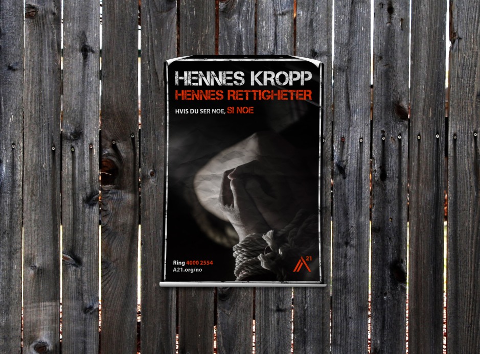
For the fourth and last semester our portfolio had to include the three Mandatory Assignments from this semester, and the reports for these. So my portfolio consists of a website, a poster and photoshoot for an awareness campaign, and a motion design title sequence.

This semester’s assignments have been fun, exciting, demanding, and inspiring. While working on each assignment I have gained a deeper understanding of the work that is put behind any design we see, and how visual elements and an identity are important factors for a brand and in design in general.

I have kept building my own design identity, and believe this today is a lot stronger than prior to this semester – yet still keeping an open mind to approach other styles and looks. Working with web design, photography, posters, iconography and motion design has broadened my knowledge in different ways of successful communication. My skills in Illustrator, Photoshop and After Effects have improved a lot, and this again has made my work process more effective and the end result more desirable.

My interactive portfolio presenting this semester’s work can be found on monikarh.com/portfolio4.

This slideshow requires JavaScript.

Portfolio Design Choices

The portfolio is meant to represent me as a designer, so I decided to make a rather minimalistic design. This is something I’ve been drawn to since I started my degree in graphic design, and does remind me of my Nordic roots. In addition to black and white, the blue colours in use are based on those in my logo. The font I used for headings is Mirza, which is the font used in my logo. To go with this I’m using the font Open Sans.

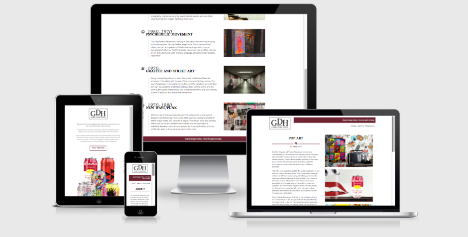
My one-page portfolio website is built from scratch, using HTML and CSS. Since this was a website that would not need updating very regularly, and it would not be a very complex one, I figured I might as well do all the coding on my own, rather than using WordPress. I believe the design of the website displays my portfolio work well, as I have very clearly separated the different assignments with a small change in the background colour. By adding a menu to the top, it is also easy to quickly navigate to the assignment of interest.

The portfolio should come across as organised, minimalistic, and easy to navigate. Because of the little use of colours, there isn’t too much going on, which lets the viewer focus more on the actual assignments – which, of course, is the main purpose of a portfolio. I also let the layout of my reports be inspired by the website, and have displayed each of the individual reports almost as if they were a page on the website itself.

– This is an extract from my report, and the whole assignment can be read here: REPORT 

Stay creative,
Monika

Report – Finished Project Exam

During these seven weeks I have spent my days at GV Reklame in Verdal, where I already worked as a graphic designer. In addition to my normal work days working with a variety of clients and projects, I did some extra work developing a brand identity for a business called TimeTrack, as well as improving some of the branding at GV Reklame. By doing this I got to design many different products, and also worked with different clients, preferences, and types of businesses. TimeTrack is a new established business, while GV Reklame has been active for more than 30 years and thus already has quite a strong brand identity.

This slideshow requires JavaScript.

Looking back at these seven weeks as a whole and all the projects I have worked on, I’m very happy with the products I have designed.

The TimeTrack profile I believe has truly come to life now, and I feel confident that the client was happy with the finished identity, including all products. I had a great dialogue with the brothers in TimeTrack throughout the whole project period, and we shared ideas and suggestions from sketches to final designs. By doing this I ensured that the identity was one they were truly satisfied with, and one they would actually keep using.

For the GV Reklame branding I’m really excited to see that I got to do something entirely different from what has done before. The design of the business was getting a little outdated, so it was about time we made some changes. My boss of course has quite a few opinions for this design, and is in that way actually a good client to work with – however, I really got to put my own style and ideas into all of this design, especially the light boards. I’m very happy to see that I learnt much more about the light boards during this period, and knowing that the regular work days will now actually be much easier for all us employees since everyone easier understands the categories and types.

This seven week long project has in many ways been very challening and hard. I have had a lot to do, and a tight schedule to follow. What I find very interesting on the other hand, is that I managed to meet all the deadlines I set myself (despite having a few products actually added to the list) – without feeling that this challenged the final designs of any of the products.

The development and process of the two main projects (TimeTrack and GV Reklame branding) were quite complex, and I feel that the necessary research and commitment was put into every product to come up with a good, functional end result.

– This is an extract from the report I submitted, and the whole report can be read here: REPORT

Until next time, stay creative,
Monika

REPORT – FINISHED GDH WEBSITE

When making the design for this website I have tried making it as simple and minimalistic as possible, yet still keeping a modern and interesting look and feel. It utilises a two column layout, and white space has closely been considered.

The purpose of the website is to display five different style periods from the 1950’s to today. It should be easy to navigate, and relaxing for the eye, not have more elements or text than needed, and strong imagery.

Visit the website here.

Responsive

The website I have designed is one I’m very happy with. I think I managed to create exactly that mood I was aiming for, and in my opinion this is a site people can easily interact with, and learn about the different style periods from. The overall design with its elements, imagery, colours and typography looks good, and should manage to engage people.

I believe I through my research and planning managed to plan out the site well before starting the coding. This got rid off most of the technical issues I could have run into, and let me plan out classes and id’s well from the start. All of this has made my coding process a lot easier – and thus a lot more fun as well. Google has been one of my best friends when coding, as people have discussed HTML and CSS codes before me on countless forums and threads, as well as videos.

The design is in many ways very similar to what I first had in mind from some of my sketches. The changes I have made since then have only improved my design, both in terms of the visual design, and also the technical issues. What has been my biggest challenge probably is to keep it as simple as possible, whilst also making it visually interesting. I have had to consider what elements and images would draw the attention of the viewer, and have had to work around that. This is something I feel I eventually managed to do with the design as it is.

I think this assignment has been very interesting and fun to work on. It was a quite open assignment where I was able to decide a little myself what I actually made (content), and that is something I think has been very fun. Making all the imagery myself was both challenging and fun as well as a good way for me to learn more about the characteristics of each style, so I’m really glad I decided to do it this way.

– This is an extract from my report, and the whole assignment can be read here: REPORT –

Until next time, stay creative,
Monika

SaveSave

REPORT – FINISHED TITLE SEQUENCE

In this assignment I have made a title sequence to kick off the Diamond Awards show in 2017. In doing this, the layout, typography, colours, elements, and animation have been very important to consider. The title sequence should convey the concept of the mood of the evening, and should appeal to the target audience.

I’m surprisingly happy with my final product. I think it really came together in the end, and the effects, transitions and animation in general work quite well. There are of course transitions etc. that could have been improved had I known my way around the program better, and the way I have done certain animations could probably have been done in much faster and more efficient ways, but I made it work without too much hassle. And that’s what is important in the end; achieving the look and feel I want, and seeing my ideas working out together.

Starting out with this assignment I had no inspiration at all. It was hard coming up with ideas since I had never worked in After Effects prior to the project. I didn’t know what I would be able to do at all; I had some ideas, but didn’t know if I would be able to go through with them at all. But once I managed to get started with some sketches, vectorising ideas, and finally starting animating I got much more excited.

I have used several videos and tutorials to help me, but I have also spent a lot of time just trying out things. Using solids to have objects appear in certain ways/areas has been very helpful, and this is how I ended up finding out how to make the “Film Production” text turn white outside the icon. There are probably other ways to achieve this as well, but I found this to work for me. All in all I’m happy with the way I managed to handle the program.

– This is an extract from my report, and the whole assignment can be read here: REPORT –

Until next time, stay creative,
Monika

Report – Finished Awareness Campaign

In this assignment I have created a poster as an awareness campaign for A21 Norway. When doing this I also did a photoshoot. For the poster I needed to closely consider the photography, and a lot of planning had to be done prior to using the camera at all. I also had to come up with the text to include in the poster. The poster is strong in its contrasts, has elements and a slogan to quickly draw attention, and is comfortable to the eye.

Poster mockup

I’m happy to say I am very happy with my finished product; including the planning of the photoshoot, the shoot itself, and the final poster a s a whole. I love the colour scheme used, as it’s harmonic and visually interesting. The hues work great together, and are consistent over all text, elements and the photographs. All typography is also legible and there shouldn’t be much confusion as to what the poster is about.

Even though it is quite simple, I personally believe the photograph in the poster is so strong that this is not at all an issue. It would get attention as a poster. The other photos from the shoot are also visually appealing and interesting to look at.

My process has in my opinion been very thorough. Before doing any designing or taking any photos, I did both research and planning as per the brief.

Having such a clear idea from the beginning, I think developing the poster has gone much smoother than it could have, had I not had a very thought through idea. I always knew which fonts and colours not to use. Since photography was also one of the key elements in this assignment, this is what I focused on the most, and feel fairly confident in having achieved well.

– This is an extract from my report, and the whole assignment can be read here: REPORT 

Until next time, stay creative,
Monika

Report – Finished Portfolio

For semester 3 our portfolio had to include the three Mandatory Assignments from this semester, and the reports for these. So my portfolio consists of a magazine design, brand building for an organic door to door company, and a poster for product advertising.

This semester’s assignments have been nothing but fun, exciting, and inspiring. While working on each assignment I have gained a deeper understanding of the work that is put behind any design we see, and how visual elements and an identity are important factors for a brand.

I have been challenged in ways that have made me better find myself as a designer and this particularly applies to logo design. I believe I have been able to find a design style I like to work with, while still being open to a vast variety of looks and feels. Working with magazine layouts and content, brand identities and touchpoints, and photography has broadened my knowledge in different ways of successful communication. My knowledge in Illustrator and InDesign has improved a lot, which has made my work process more effective and the end result more desirable. Everything I have learnt are skills I will make good use of as a designer.

My interactive portfolio presenting this semester’s work can be found on portfolio3.monikarh.com.

This slideshow requires JavaScript.

Portfolio Design Choices

The portfolio is meant to represent me as a designer, so I decided to make a rather minimalistic design. This is something I’ve been drawn to since I started my degree in graphic design, and does remind me of my Nordic roots. In addition to black and white, the blue colour in use is based on one of my logo colours. The font I used for headings is Overlock SC which is a font similar to the one in my logo. To go with this I’m using the font Open Sans.

My website is a child theme based on DinevThemes’ theme Teletype, but with quite a few adjustments to have it suit my needs and design wishes better. I think this theme displays portfolio work really well as it allows me to present the different projects in a nice matter already on the home page.

The portfolio should come across as organised, minimalistic, and easy to navigate. Because of the little use of colours, there isn’t too much going on, which lets the viewer focus more on the actual assignments – which, of course, is the main purpose of a portfolio. I also let the layout of my reports be inspired by the website, and have displayed each of the individual reports almost as if they were a page on the website itself.

– This is an extract from my report, and the whole assignment can be read here: REPORT 

Until next time, stay creative,
Monika

Report – LUHB-Festivalen

In this assignment I have developed the visual identity for Levanger Urbane Hage- og Blomsterfestival (LUHB-Festivalen). In doing this, I have had to do thorough strategic analysis and research, and then come up with a visual design to create the festival’s visual identity. All touchpoints created stay true to this identity, and should be appealing to the target group as well as communicating the festival’s essence.

This slideshow requires JavaScript.

I am happy with how the finished products, from logo to touchpoints to brand manual, came out. Using my colour scheme and set fonts, I think I have managed to create an identity that successfully expresses and communicates what the festival is about.

The logo definitely gets my attention, and it seems to have engaged everyone I have shown it to thus far. Keeping things simple can be a bit challenging at times, but I think the strong colours and my illustrations work around this in a good way, and create enough interest to grab attention.

Working on this assignment has been time consuming, a little challenging, but most of all fun. I definitely think I in one way or another have seen all learning outcomes come to play a role in the process from start to finish. The thorough research I did beforehand truly helped me get a good start when putting pen to paper.

My target group has been on my mind through the whole process, since I know it is important to reach this group for a successful design. I have mostly focused on children, and I believe this shows. All in all the final products have developed the visual identity I had in mind early on, and the brand manual should reflect this.

Through this project exam I have learnt more about researching and analysing prior to a project, creative work and processes, design principles and layouts, creative solutions, and working in Illustrator. Most of all though, I have achieved a better understanding of the process of building a visual identity from scratch.

– This is an extract from the report I submitted, and the whole report can be read here: REPORT –

Until next time, stay creative,
Monika

Report – Door to Door Organics

In this assignment I have developed the new visual identity for Door to Door Organics’s expansion to my local community. In doing this, I have had to do thorough strategic analysis and research, and then come up with a visual design to create the brand identity. All products created stay true to the new identity, and should be appealing to the target group as well as communicating the brand essence.

Box Mock Up1-2

2

I am happy with how the finished products, from logo to touchpoints to brand manual, came out. Using my colour scheme and set fonts, I think I have managed to create a brand identity which expresses and communicates what the business is about.

The logo is definitely one that gets my attention, and it seems to have engaged everyone I have shown it to thus far, which makes me think it is successful. Keeping things simple can be a bit challenging at times, but I think the strong colours and my illustrations work around this in a good way, and create enough interest to grab attention.

Since this assignment was very focused on the research stage and strategic analysis, I have definitely learnt a lot about this. I really got to see how much one can benefit of defining the problem, setting up creative briefs, and constructing a visual identity from the start. My process has been quite a long one, and I have spent a lot of time thinking of how to keep the brand true to the identity I wanted to develop.

The consumer profile I set up has been on my mind through the whole process, since I know it is important to reach this group through the design. I have focused most on kids, and in trying to reach families with young kids; and believe I have achieved this. All in all the final products have developed the brand identity I had in mind.

– This is an extract from the report I submitted, and the whole report, including the brand manual, can be read here: REPORT –

Until next time, stay creative,
Monika

SaveSave

Report – Product Advertising

In this assignment I have created a poster to promote a skate park as a pedestrian area of my hometown. For this I needed to closely consider the photography, and I had to come up with a logo as well as other graphic elements to reach my target group. The poster is strong in its contrasts, has elements and a slogan to quickly draw attention, and is comfortable to the eye.

Poster_mockup_small

I’m glad I can say I am very happy with my finished product; including the logo, the photograph, and the final poster as a whole. This is the first time I made myself such a specific target group, and I’m glad I finally got around to doing so, as this is also the first time I feel I have a product that really speaks to the targeted group. So all in all, I believe this has been the biggest lesson learnt from this assignment; try to narrow down the audience as much as possible.

I love the colour scheme used, as it’s harmonic and visually appealing. The hues work great together, and are consistent over all graphics and the photograph. All typography is also legible and there shouldn’t be much confusion as to what or where the skate park is.

My process has in my opinion been very thorough. Maybe I should have done more hand drawn sketches for the actual posters, but as explained I thought it would be just as easy to do this in Photoshop, where I had the logo’s shape, and easily could move elements around. Especially since I had so many photos I wanted to try out at first, to see which would work best as a poster, I think this was a good way of going about it.

Having such a clear idea from the beginning, I think developing the poster has gone much smoother than it could have, had I not had a very thought through idea. I always knew which fonts and colours not to use. Since photography was also one of the key elements in this assignment, this is what I focused on the most, and feel fairly confident in having achieved well.

– This is an extract from the report I submitted, and the whole report can be read here: REPORT –

Until next time, stay creative,
Monika

Report – Magazine Design

In this assignment I have created a magazine called Vision Earth. In doing this, the layout, typography, colours, photography and illustrations, and other visual elements have been very important. The magazine should appeal to its target audience, and there is a visual identity running through the entire magazine, as well as in each of the articles.

Style Board

I’m happy with the finished product. This assignment has probably been one of the most time consuming I’ve had so far, as I put a lot of time and effort into creating many illustrations in particular. This is a process which always takes a lot of time, since I usually aim for my illustrations to be pretty realistic. I do think the final images I have come up with both suit the magazine, and have the feeling I want them to.

I’m glad I have been able to create a visual similarity throughout the magazine, but at the same time each article also has its unique theme, so to speak. This makes it easy for readers to follow and always know what content belongs to which article.

My process has been very thorough in my opinion. I have done sketches both by hand and digitally, I have researched other magazines, and I have looked for inspiration both online and in other books. Most of the time I have also had a pretty good communication with tutors, to make sure I got feedback from others than myself.

The magazine as it ended up is quite different from what I first pictured it, but I really do believe all the changes I have made, and the ideas I have come up with benefit it. Vision Earth’s identity should come across, and I personally think it speaks to the target group. Some elements may seem a little “simple” or “childish” at times, but I think this only helps make the content seem a little less daunting to get through.

– This is an extract from the report I submitted, and the whole report, including the magazine, can be read here: REPORT –

Until next time, stay creative
Monika