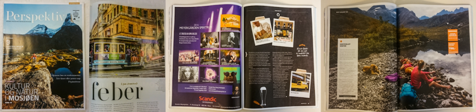
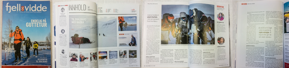
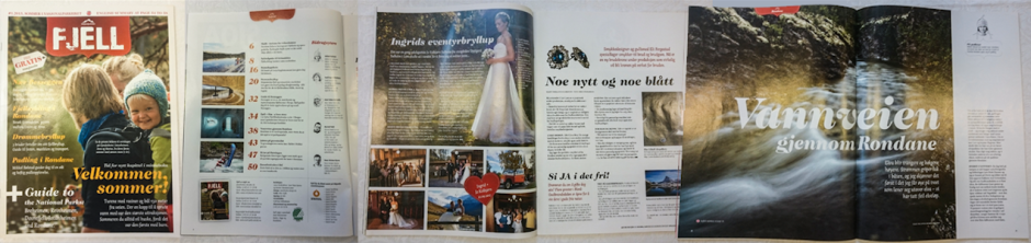
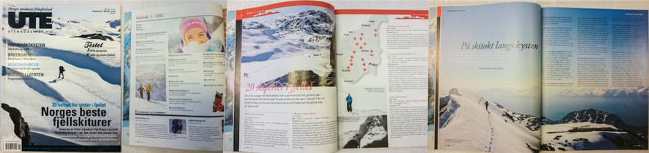
In this assignment I have created a magazine called Vision Earth. In doing this, the layout, typography, colours, photography and illustrations, and other visual elements have been very important. The magazine should appeal to its target audience, and there is a visual identity running through the entire magazine, as well as in each of the articles.
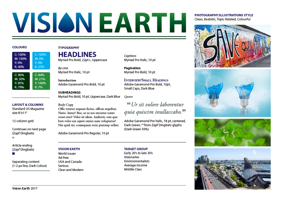
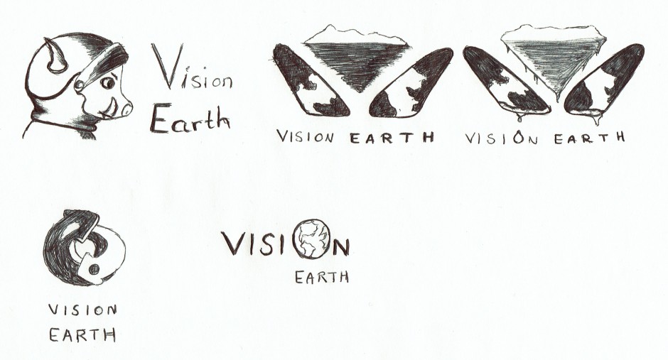
I’m happy with the finished product. This assignment has probably been one of the most time consuming I’ve had so far, as I put a lot of time and effort into creating many illustrations in particular. This is a process which always takes a lot of time, since I usually aim for my illustrations to be pretty realistic. I do think the final images I have come up with both suit the magazine, and have the feeling I want them to.
I’m glad I have been able to create a visual similarity throughout the magazine, but at the same time each article also has its unique theme, so to speak. This makes it easy for readers to follow and always know what content belongs to which article.
My process has been very thorough in my opinion. I have done sketches both by hand and digitally, I have researched other magazines, and I have looked for inspiration both online and in other books. Most of the time I have also had a pretty good communication with tutors, to make sure I got feedback from others than myself.
The magazine as it ended up is quite different from what I first pictured it, but I really do believe all the changes I have made, and the ideas I have come up with benefit it. Vision Earth’s identity should come across, and I personally think it speaks to the target group. Some elements may seem a little “simple” or “childish” at times, but I think this only helps make the content seem a little less daunting to get through.
– This is an extract from the report I submitted, and the whole report, including the magazine, can be read here: REPORT –
Until next time, stay creative
Monika