Semester 3

Report – Finished Portfolio

For semester 3 our portfolio had to include the three Mandatory Assignments from this semester, and the reports for these. So my portfolio consists of a magazine design, brand building for an organic door to door company, and a poster for product advertising.

This semester’s assignments have been nothing but fun, exciting, and inspiring. While working on each assignment I have gained a deeper understanding of the work that is put behind any design we see, and how visual elements and an identity are important factors for a brand.

I have been challenged in ways that have made me better find myself as a designer and this particularly applies to logo design. I believe I have been able to find a design style I like to work with, while still being open to a vast variety of looks and feels. Working with magazine layouts and content, brand identities and touchpoints, and photography has broadened my knowledge in different ways of successful communication. My knowledge in Illustrator and InDesign has improved a lot, which has made my work process more effective and the end result more desirable. Everything I have learnt are skills I will make good use of as a designer.

My interactive portfolio presenting this semester’s work can be found on portfolio3.monikarh.com.

This slideshow requires JavaScript.

Portfolio Design Choices

The portfolio is meant to represent me as a designer, so I decided to make a rather minimalistic design. This is something I’ve been drawn to since I started my degree in graphic design, and does remind me of my Nordic roots. In addition to black and white, the blue colour in use is based on one of my logo colours. The font I used for headings is Overlock SC which is a font similar to the one in my logo. To go with this I’m using the font Open Sans.

My website is a child theme based on DinevThemes’ theme Teletype, but with quite a few adjustments to have it suit my needs and design wishes better. I think this theme displays portfolio work really well as it allows me to present the different projects in a nice matter already on the home page.

The portfolio should come across as organised, minimalistic, and easy to navigate. Because of the little use of colours, there isn’t too much going on, which lets the viewer focus more on the actual assignments – which, of course, is the main purpose of a portfolio. I also let the layout of my reports be inspired by the website, and have displayed each of the individual reports almost as if they were a page on the website itself.

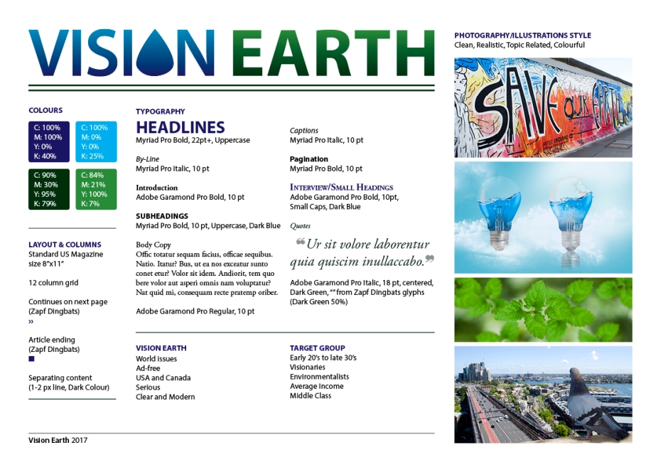
– This is an extract from my report, and the whole assignment can be read here: REPORT 

Until next time, stay creative,
Monika

Report – LUHB-Festivalen

In this assignment I have developed the visual identity for Levanger Urbane Hage- og Blomsterfestival (LUHB-Festivalen). In doing this, I have had to do thorough strategic analysis and research, and then come up with a visual design to create the festival’s visual identity. All touchpoints created stay true to this identity, and should be appealing to the target group as well as communicating the festival’s essence.

This slideshow requires JavaScript.

I am happy with how the finished products, from logo to touchpoints to brand manual, came out. Using my colour scheme and set fonts, I think I have managed to create an identity that successfully expresses and communicates what the festival is about.

The logo definitely gets my attention, and it seems to have engaged everyone I have shown it to thus far. Keeping things simple can be a bit challenging at times, but I think the strong colours and my illustrations work around this in a good way, and create enough interest to grab attention.

Working on this assignment has been time consuming, a little challenging, but most of all fun. I definitely think I in one way or another have seen all learning outcomes come to play a role in the process from start to finish. The thorough research I did beforehand truly helped me get a good start when putting pen to paper.

My target group has been on my mind through the whole process, since I know it is important to reach this group for a successful design. I have mostly focused on children, and I believe this shows. All in all the final products have developed the visual identity I had in mind early on, and the brand manual should reflect this.

Through this project exam I have learnt more about researching and analysing prior to a project, creative work and processes, design principles and layouts, creative solutions, and working in Illustrator. Most of all though, I have achieved a better understanding of the process of building a visual identity from scratch.

– This is an extract from the report I submitted, and the whole report can be read here: REPORT –

Until next time, stay creative,
Monika

Report – Door to Door Organics

In this assignment I have developed the new visual identity for Door to Door Organics’s expansion to my local community. In doing this, I have had to do thorough strategic analysis and research, and then come up with a visual design to create the brand identity. All products created stay true to the new identity, and should be appealing to the target group as well as communicating the brand essence.

Box Mock Up1-2

2

I am happy with how the finished products, from logo to touchpoints to brand manual, came out. Using my colour scheme and set fonts, I think I have managed to create a brand identity which expresses and communicates what the business is about.

The logo is definitely one that gets my attention, and it seems to have engaged everyone I have shown it to thus far, which makes me think it is successful. Keeping things simple can be a bit challenging at times, but I think the strong colours and my illustrations work around this in a good way, and create enough interest to grab attention.

Since this assignment was very focused on the research stage and strategic analysis, I have definitely learnt a lot about this. I really got to see how much one can benefit of defining the problem, setting up creative briefs, and constructing a visual identity from the start. My process has been quite a long one, and I have spent a lot of time thinking of how to keep the brand true to the identity I wanted to develop.

The consumer profile I set up has been on my mind through the whole process, since I know it is important to reach this group through the design. I have focused most on kids, and in trying to reach families with young kids; and believe I have achieved this. All in all the final products have developed the brand identity I had in mind.

– This is an extract from the report I submitted, and the whole report, including the brand manual, can be read here: REPORT –

Until next time, stay creative,
Monika

SaveSave

Report – Product Advertising

In this assignment I have created a poster to promote a skate park as a pedestrian area of my hometown. For this I needed to closely consider the photography, and I had to come up with a logo as well as other graphic elements to reach my target group. The poster is strong in its contrasts, has elements and a slogan to quickly draw attention, and is comfortable to the eye.

Poster_mockup_small

I’m glad I can say I am very happy with my finished product; including the logo, the photograph, and the final poster as a whole. This is the first time I made myself such a specific target group, and I’m glad I finally got around to doing so, as this is also the first time I feel I have a product that really speaks to the targeted group. So all in all, I believe this has been the biggest lesson learnt from this assignment; try to narrow down the audience as much as possible.

I love the colour scheme used, as it’s harmonic and visually appealing. The hues work great together, and are consistent over all graphics and the photograph. All typography is also legible and there shouldn’t be much confusion as to what or where the skate park is.

My process has in my opinion been very thorough. Maybe I should have done more hand drawn sketches for the actual posters, but as explained I thought it would be just as easy to do this in Photoshop, where I had the logo’s shape, and easily could move elements around. Especially since I had so many photos I wanted to try out at first, to see which would work best as a poster, I think this was a good way of going about it.

Having such a clear idea from the beginning, I think developing the poster has gone much smoother than it could have, had I not had a very thought through idea. I always knew which fonts and colours not to use. Since photography was also one of the key elements in this assignment, this is what I focused on the most, and feel fairly confident in having achieved well.

– This is an extract from the report I submitted, and the whole report can be read here: REPORT –

Until next time, stay creative,
Monika

Report – Magazine Design

In this assignment I have created a magazine called Vision Earth. In doing this, the layout, typography, colours, photography and illustrations, and other visual elements have been very important. The magazine should appeal to its target audience, and there is a visual identity running through the entire magazine, as well as in each of the articles.

Style Board

I’m happy with the finished product. This assignment has probably been one of the most time consuming I’ve had so far, as I put a lot of time and effort into creating many illustrations in particular. This is a process which always takes a lot of time, since I usually aim for my illustrations to be pretty realistic. I do think the final images I have come up with both suit the magazine, and have the feeling I want them to.

I’m glad I have been able to create a visual similarity throughout the magazine, but at the same time each article also has its unique theme, so to speak. This makes it easy for readers to follow and always know what content belongs to which article.

My process has been very thorough in my opinion. I have done sketches both by hand and digitally, I have researched other magazines, and I have looked for inspiration both online and in other books. Most of the time I have also had a pretty good communication with tutors, to make sure I got feedback from others than myself.

The magazine as it ended up is quite different from what I first pictured it, but I really do believe all the changes I have made, and the ideas I have come up with benefit it. Vision Earth’s identity should come across, and I personally think it speaks to the target group. Some elements may seem a little “simple” or “childish” at times, but I think this only helps make the content seem a little less daunting to get through.

– This is an extract from the report I submitted, and the whole report, including the magazine, can be read here: REPORT –

Until next time, stay creative
Monika

Report – Design Journey

The first week of GRA2 is officially over, and to get started with the year we got our first Mandatory Assignment. We only had a week on this, so the main purpose of this assignment was to get a bit of an overview of the course structure, and reflect on what we have learnt from the previous year. I wasn’t sure whether or not to submit a report for this since it wasn’t mentioned in the brief, so I just wrote a very short one with a few notes.

To visualise the entire Graphic Design course structure and reflect my own progression over the two previous semesters, I have decided to make an infographic with inspiration from the video game Super Mario, mixed with my own ideas. I have brought this design structure with me to create the artist statement as well, so these images are strongly tied together.

Infographic_100

Artist Statement_100

I’m happy with the end result of this infographic. I find it fun, and I think it presents the structure of the course well. It also represents me as a designer. The artist statement was probably my biggest struggle, having to keep it at a maximum of 400 letters as per the brief, but reading a few short artist statements on The Art League Blog helped me with inspiration.

See the whole assignment including the report here.

Until next time, stay creative,
Monika