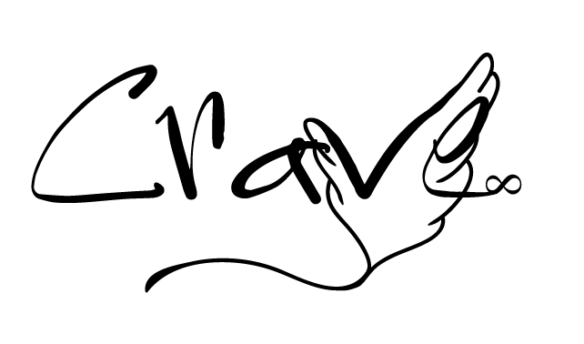
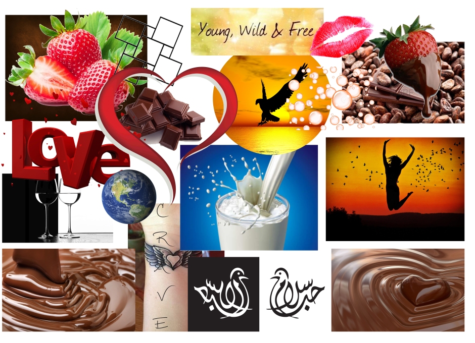
In this assignment I have tried capturing the feeling of being a teenager with the way I think a chocolate brand logo should look like. I researched other chocolate brands only to find out that some of these look very serious and I decided that I wanted something that could be more fun, yet not too childish.
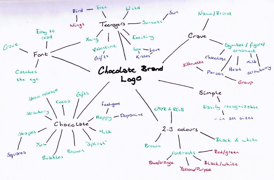
I have tried telling myself that simplicity is key, and not added more elements than I felt necessary. The logo needs to give the brand Crave some identity, distinct it from its market competitors, and communicate a positive message about the brand.
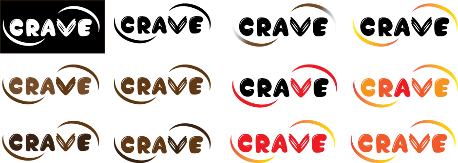
-

- RGB
-

- CMYK
-

- Black & White
RGB – CMYK – Black & White
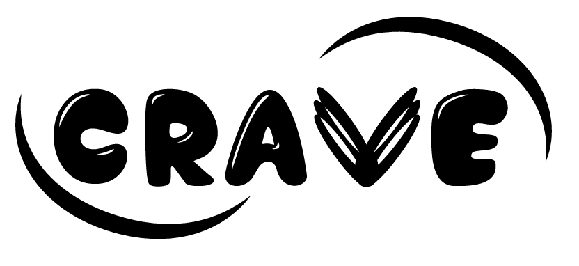
Although quite different from what I first imagined it would look like, I am rather happy about the design I have created. As I said in the introduction, I wanted to make a logo that gave the brand Crave an identity; a logo that could distinct it from the market competitors; and a logo that would communicate something positive about the brand. I think my logo does this, and I don’t think it’s hard to understand it’s a chocolate brand logo.
Because of the few elements used, it should work well both in smaller and larger scales, but could lose some information if it’s too small. On a lighter note, it looks good both in black and white as well as in colour, which is very important.
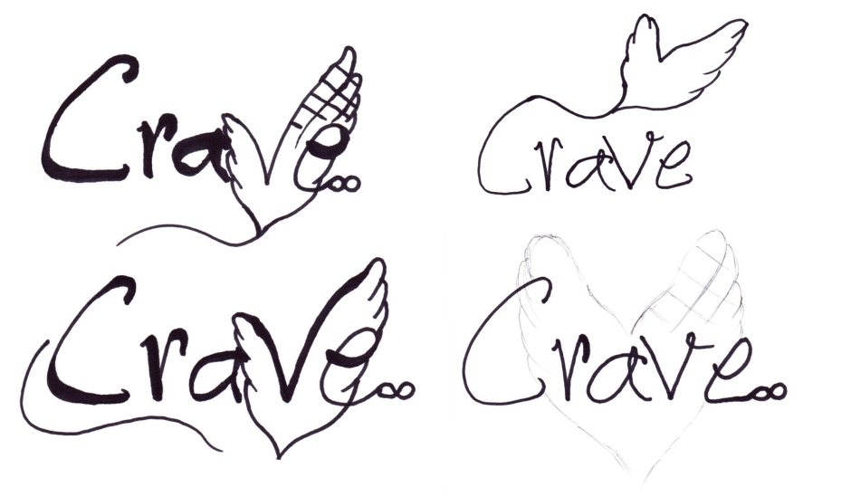
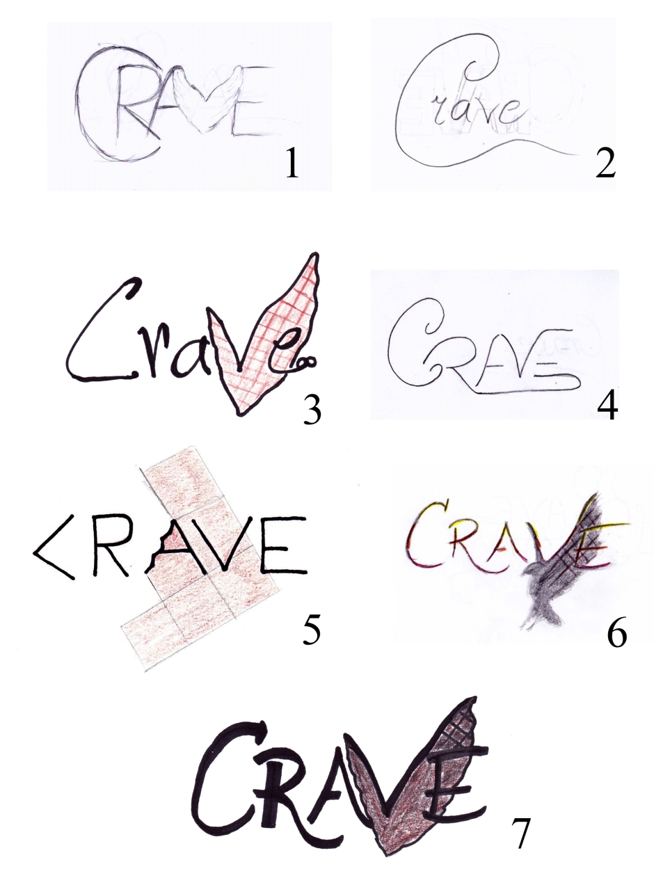
This has been an incredibly interesting process because I have tried out so many ideas, and really got to see the process of refining ones ideas. My finished product is very different from what I had in mind when I first began, but I believe it is for the best: It communicates my message, and it has all the elements that I wanted without them becoming too dominant in the overall design.
For later projects I have proved to myself that having a schedule is a good idea, and that I should stick to making that. Illustrator and I have become better friends as well, which I’m sure will help me produce designs faster and easier in the future. Finally, this has been a fun assignment that has taught me a lot about logos and logo designs.
– This is an extract from the report I submitted, and the whole report can be read here: REPORT –
Until next time, stay creative,
Monika
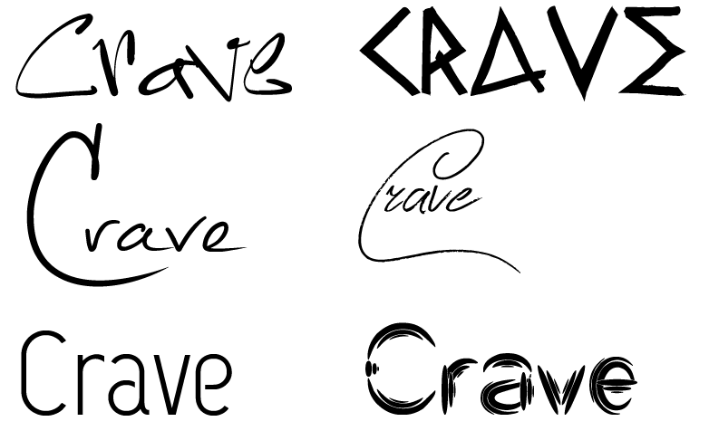 Fonts, from top right to bottom left; Sistah Ysse, Raw Delta Hand Street, Mathilde, Zentaiges, Capsuula, and Quantum Leap.