MA 04: Design History Website

REPORT – FINISHED GDH WEBSITE

When making the design for this website I have tried making it as simple and minimalistic as possible, yet still keeping a modern and interesting look and feel. It utilises a two column layout, and white space has closely been considered.

The purpose of the website is to display five different style periods from the 1950’s to today. It should be easy to navigate, and relaxing for the eye, not have more elements or text than needed, and strong imagery.

Visit the website here.

Responsive

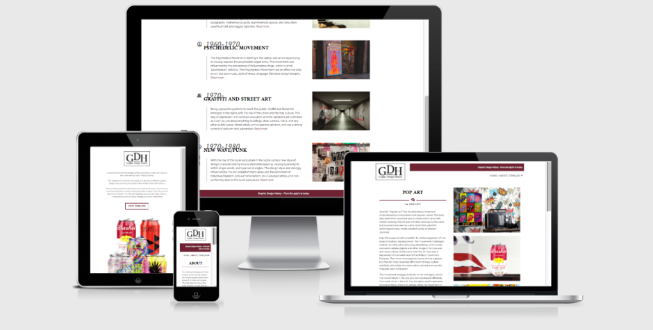
The website I have designed is one I’m very happy with. I think I managed to create exactly that mood I was aiming for, and in my opinion this is a site people can easily interact with, and learn about the different style periods from. The overall design with its elements, imagery, colours and typography looks good, and should manage to engage people.

I believe I through my research and planning managed to plan out the site well before starting the coding. This got rid off most of the technical issues I could have run into, and let me plan out classes and id’s well from the start. All of this has made my coding process a lot easier – and thus a lot more fun as well. Google has been one of my best friends when coding, as people have discussed HTML and CSS codes before me on countless forums and threads, as well as videos.

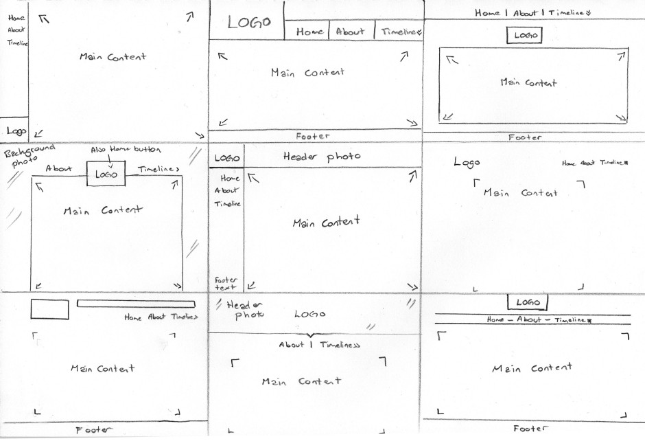
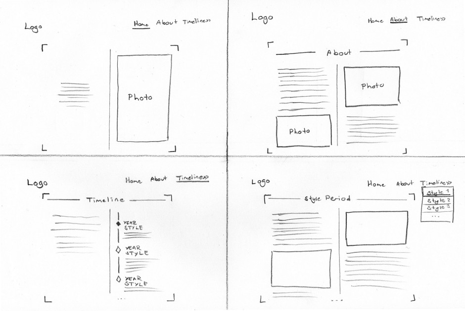
The design is in many ways very similar to what I first had in mind from some of my sketches. The changes I have made since then have only improved my design, both in terms of the visual design, and also the technical issues. What has been my biggest challenge probably is to keep it as simple as possible, whilst also making it visually interesting. I have had to consider what elements and images would draw the attention of the viewer, and have had to work around that. This is something I feel I eventually managed to do with the design as it is.

I think this assignment has been very interesting and fun to work on. It was a quite open assignment where I was able to decide a little myself what I actually made (content), and that is something I think has been very fun. Making all the imagery myself was both challenging and fun as well as a good way for me to learn more about the characteristics of each style, so I’m really glad I decided to do it this way.

– This is an extract from my report, and the whole assignment can be read here: REPORT –

Until next time, stay creative,
Monika

SaveSave

GDH: Sketches

Based on websites I saw in my research, I tried out a few layout ideas in the first process.

Sketches – Since I prefer doing my initial sketches by hand, this is what I did this time as well. As one can see here, I have tried a few different placements for the menu bar and the logo; mostly with a horizontal menu bar, but also vertical.

I did, however, quickly realise that I prefer a horizontal menu, as this is what we usually see when entering a website, and thus kind of expect to see. This way I also feel there is more room for the actual content below. I also like having the logo towards the top of the screen, since this should be one of the first things people see when entering the site. This helps establishing who’s website it is, and also gives an idea of what to expect from the site.

Sketches1

I then chose two of my favourite ideas from these sketches, and tried out the layout for all pages I need to make (with one layout that would be used for all style periods).

Wireframe 1

Wireframe1

(more…)

GDH: Content

I began gathering relevant information about the different time periods. This took quite a lot of time, as I wanted to explain the styles in general, and also find relevant characteristics, artists, and social events that somehow effected the different periods and artists of the time. While doing this research I also made different designs to further reflect and describe the periods. This will help the viewers better understand the styles, and also made me learn a lot more than by reading and writing only.

I will just write down the summary of the texts for each of the style period here.

POP ART (1950-1970)

Short for “Popular art,” Pop Art described a movement characterised by consumerism and popular culture. The basic idea behind the movement was to create a form of art with instant meaning. Pop Art was not taken seriously by the public, but to some it was seen as a form of art that suited the technological mass-media oriented society of Western countries.

This slideshow requires JavaScript.


(more…)

GDH: Research

Due Week 32, Friday 12.01.18 at 4pm

For this assignment I need to design a website to display five different design styles from the 1950s to today.

Defining Concept – The concept of the site is to gather relevant information about five periods/styles within Graphic Design from 1950 until today. These periods are Pop Art (1950-1970), International Typographic Style/Swiss Style (1950-late 1960), Psychedelic Movement (1960-mid 1970), Graffiti and Street Art (1970-), and New Wave/Punk (1970- mid 1980). Its purpose is to teach graphic design students about the style periods, through text and visual elements. The site should navigate teach the visitors about 2-3 graphic designers active in the selected period, and also parallel social events that influenced the period. The website needs to have an interactive timeline.

It will consist of 8 pages: Home page (visual presentation of style periods), About page (about the website), Timeline page (interactive timeline), Pop Art, Swiss Style, Psychedelic Movement, Graffiti and Street Art, and New Wave/Punk pages (about each of the movements). Only the Home, About, and Timeline pages will be in the top menu; the actual style pages will show through a dropdown menu under Timeline, and the timeline on this page will also navigate the user to the different periods.

Defining Target Group – The target group are graphic design students. The majority of these will be young adults (19-25), and both males and females. They may of course also be adults of older age, who either wish to broaden their knowledge in a field they might already be working in, or just changing their direction of field. Since they are students they’re currently in school, and are still in the process of finishing their education. Graphic Design will (hopefully) be one of their main interests, which means the design, look and feel of the website is even more vital to consider.

The website may be a source for the target group to learn about the history of graphic design. All information should therefore be easy to understand and comprehend, well descriptive, short and concise, and of course be correct.

(more…)

27.1: Research on Late Modernism

Consider what we have discussed regarding Late Modernism in the USA and The Swiss International Style. Do additional research on the Swiss International Style – it may be a good idea to study some of the known designers of this style and period. As a guide, visit designhistory.com, which gives a brief outline of specific designers and styles – take note that here the Swiss International Style is listed under 1940, which is not incorrect as the style was developed in the late 40s, but flourished in the 50s. Also use additional reference sources of your own and do a write-up of the following:

Research on the Swiss International Style

After you have done research on the style, give a description of your own. How would you define the style? Do a write-up of about 350 words and discuss the characteristics of the style, the typefaces that were prominent and the philosophy behind it.

I would define The Swiss International style as a style focusing on typography, and to narrow it down even more: sans-serif typography. This style was more about communication of the content than decorative visual elements. Swiss designers saw their designs as socially useful.

Also called The Swiss Style, The International Typographic Style was developed in Switzerland in the 1950s. This is a design style which featured typography as a primary design element. The movement focused on simplicity, legibility, and objectivity, and developed sans-serif typography, mathematical grids, asymmetrical layouts, very often used flush left and ragged right text, the elimination of ornaments, and black and white photography.

With the separation of design from fine art, came the birth of grid-based design in the 19th century. However, to appreciate the grid systems in the Swiss style, we have to understand that they wouldn’t be anything without the typefaces developed. Swiss Style artists argued that the content should be the focal point, not the decorative extras. As a result of this the fonts developed are stripped for distractions, and allows reading rather than admiring.

Sans-serif fonts developed during the Swiss Style movement were for example Akzidenz-Grotesk, Univers, and Helvetica. Univers was designed by Adrian Frutiger in 1954. This typeface is inspired by Akzidens-Grotesk, but with a much larger font family with various sizes and weights. This helped designers use only one typeface rather than several, because the different weights and sizes together could create so much visual interest alone.

To sum up, characteristics of the Swiss International Style are thus: Cleanliness, readability, objectivity. It should be recognised by the use of neutrality, grid systems, graphics asymmetrical layouts, and sans-serif typography such as Akzidenz-Grotesk, Univers, and Helvetica. Typography was the primary design element, and text was typically flushed left, ragged right.

Posters were some of the most influential work because of their effective means of communication, as taught by teacher, graphic designer and writer Armin Hofmann.

(more…)