MA 03: Product Advertising

Report – Product Advertising

In this assignment I have created a poster to promote a skate park as a pedestrian area of my hometown. For this I needed to closely consider the photography, and I had to come up with a logo as well as other graphic elements to reach my target group. The poster is strong in its contrasts, has elements and a slogan to quickly draw attention, and is comfortable to the eye.

Poster_mockup_small

I’m glad I can say I am very happy with my finished product; including the logo, the photograph, and the final poster as a whole. This is the first time I made myself such a specific target group, and I’m glad I finally got around to doing so, as this is also the first time I feel I have a product that really speaks to the targeted group. So all in all, I believe this has been the biggest lesson learnt from this assignment; try to narrow down the audience as much as possible.

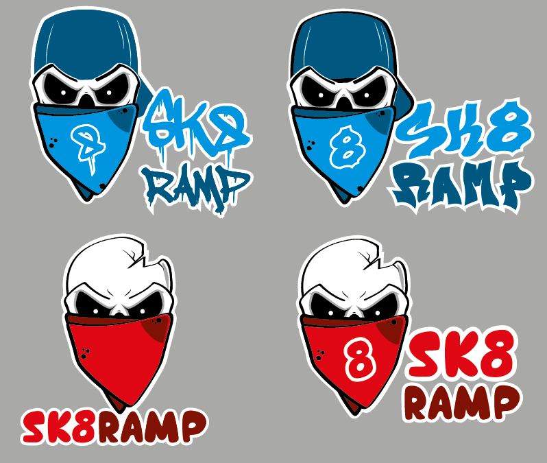
I love the colour scheme used, as it’s harmonic and visually appealing. The hues work great together, and are consistent over all graphics and the photograph. All typography is also legible and there shouldn’t be much confusion as to what or where the skate park is.

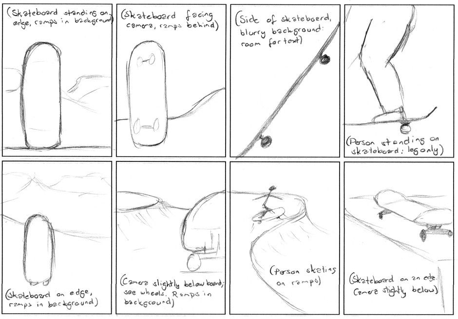
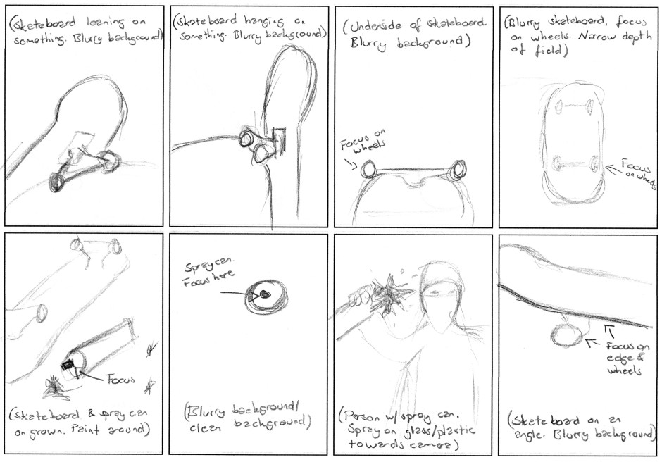
My process has in my opinion been very thorough. Maybe I should have done more hand drawn sketches for the actual posters, but as explained I thought it would be just as easy to do this in Photoshop, where I had the logo’s shape, and easily could move elements around. Especially since I had so many photos I wanted to try out at first, to see which would work best as a poster, I think this was a good way of going about it.

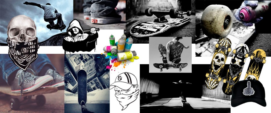
Having such a clear idea from the beginning, I think developing the poster has gone much smoother than it could have, had I not had a very thought through idea. I always knew which fonts and colours not to use. Since photography was also one of the key elements in this assignment, this is what I focused on the most, and feel fairly confident in having achieved well.

– This is an extract from the report I submitted, and the whole report can be read here: REPORT –

Until next time, stay creative,
Monika

Sk8 Ramp Poster

After choosing my favourite photos, as shown in my previous post, I sketched out a few layout ideas for the poster in Photoshop. The text “Lev vel” means “Live well/happily”, and “Rull med oss i Gågata” means “Role with us in Gågata”. The whole time I have tried to keep a colour scheme using blue and hues of grey, as I think this integrates well with both the logo and then also the target group.

This slideshow requires JavaScript.

After asking for feedback on these ideas on Moodle, I was glad to see my tutor agreed with me on which two designs were the strongest. So I kept working on these two, trying out some other fonts, and making sure the slogan and byline are readable and draw enough attention.

Poster 1 Fonts

What I like about this poster is how the photograph communicates more than just one thing about the area; it is not only about skating, but really also about being a little rebellious. The colour scheme works perfect with the logo, and the splash behind the word “LEV” really brings this out, and draws more attention to the slogan.

This slideshow requires JavaScript.

Poster 2 Fonts

I like the darkness, and the really strong contrasts in this photo. To me, this captures the exact mood that I wish to communicate, and I love how the focus is on the blue in the front of the skateboard, whilst the rest is blurry. This makes for a neater background to place the logo and other text on, and I also feel like there is a nice connection between the different (although few) elements.

This slideshow requires JavaScript.

I have later adjusted a few minor things on the two posters, and chosen one of these fonts to go with, and in my opinion I have come up with a design that ties well to the concept. It communicates something about the area, and I think it’s visually appealing and interesting to look at, and most importantly it reaches the target group.

Until next time, stay creative,
Monika

Sk8 Ramp Photography

A very important part of MA03 is the photography. In the brief it is stated that the assignment’s goal is to “get to grips with photography and how to use your camera creatively as well as expreimenting with lighting. It is important to think about what works together to create the right atmosphere using model/view/lighting etc.” and that we should “brainstorm and have a clear understanding of the idea so you can take creative pictures.”

So before I brought my camera out with me, I did a few simple sketches to get an idea of what kind of angles I could try and photograph my skateboard at. Before drawing I also went to the park to see what the ramps really looked like (I have been there a few times, but never really paid much attention to the actual lines and everything).

CCI23052017

CCI23052017_2

So with these ideas in mind, and knowing that more angles and views etc. would come to me as I was out there, I went to the park in the evening this weekend. Coming back I had over 90 photos, and edited and chose my best out of these. I quickly saw whilst editing that I wanted to turn down the hues quite a bit, pump up contrasts, and also add a bit of an HDR effect, as this really fits my concept of it being a little rough.

This slideshow requires JavaScript.

I wanted to try a few more photos, though, so I did some more at home. One idea I had was to use a spray can and sort of spray towards the camera: this, although I find it an interesting idea, turned out to be pretty hard though. I made myself a frame I put plastic on, and then had quite the workout being both behind and in front of the camera. The problem however, was that the plastic looked too much like that; the reflection from the light around showed, which just didn’t work. So if I had had a big piece of glass instead, that probably would have worked better. But it was still fun to try out. And even though I didn’t use that idea, I did bring my spray can with me for other photos as well.

This slideshow requires JavaScript.

Since this I have pretty much finalized my poster as well, but will make a separate post about that.

Until next time, stay creative,
Monika

Sk8 Ramp Concept and Logo

Due Week 10, Friday 26.05.17 at 4 pm

We go from MA01 to MA03 due to changes in the schedule, but will get back to MA02 after this. For MA03 however, I need to produce a poster to promote a pedestrian zone (of our choosing). In this poster I need to include a logo, slogan, photography, and other graphic elements I may wish to include. It should be in A2 format, and portrait oriented.

Pedestrian Zone

Skate Ramp is a skate park in my hometown, located right outside the heart of the city centre. This is a park in which people can be social and get some activity, whilst also enjoying being outside. It is a pedestrian zone, which according to Wikipedia is an “area of a city or town reserved for pedestrian-only use and in which most or all automobile traffic may be prohibited.”

Ramp does indeed refer to an actual skate ramp, but this word is also a Norwegian word which translates to Hooligan – “A violent young troublemaker, typically one of a gang” (Oxforddictionaries). In Norwegian this word will not only be used when this violence or troublemaking is very serious, but may also be something parents say to their kids when they’re being a little bad.

Target Group

Skate Ramp’s target audience are teenagers and up, in the age between 13 to 21. The average skater is a boy, with a bit of a tough or cool attitude. His personality is a little rebellious, and in addition to skating he enjoys graffiti and will often have an opinion about society and pretty much everything else. Skating is a way for him to spend time outdoors, both as a social activity, but also because he likes the possible danger around it. He sees this as another way to express himself and his rather careless attitude towards duties and expectations.

He will be in school, but will not be the one who pays the most attention in class. Since Skate Ramp is located in Levanger, the boy will live in this area. He is likely to spend more time on the ramp than at home doing his homework, and is the ultimate “skateramp” (skater hooligan).

Moodboard

Logo

I had a very clear idea of the logo’s style from the beginning, as this is a style I’ve been interested in trying out for ages, but haven’t found the right project for yet. So I was so excited when beginning the work of Sk8 Ramp’s logo.

As always this process began with handdrawn scamps, trying out a few different ideas; quite a few that are in the style that I wanted to try (the skulls), and also some others just to try keeping an open mind. I tried using a horse because that’s what is used in my hometown’s coat of arms – and did some tribal drawings of this to better reach the target group. However, I quickly saw that my favourite ideas were those using a skull.

I produced five different skulls in Illustrator (so excited that I managed to illustrate them the way I wanted here as well), all based on the same drawing/head, but with different elements. So I uploaded these five ideas to Moodle for feedback, and was really glad to see my idea and concept seemed to work on others as well.

Screen Shot 2017-05-18 at 12.03.39

And finally, after some playing around with font placement, fonts, colours, etc., I have come up with a design I’m super happy with myself. I really feel like this logo speaks to my target audience, and it definitely communicates my message. Using the white outline is also great should I end up placing it on a busy background.

Sk8 Ramp logo

So I’m definitely excited to keep working on this assignment, and seeing what I end up with! Next up will be the sketching out ideas for the layout and poster, take photos, come up with a catchy slogan, and finally bind all elements together.

Until next time, stay creative,
Monika